Animate runtime progress bars with UI Toolkit UI Toolkit
A lot goes into creating an intuitive experience for your player. Progress bars are often used to reassure the player that something is happening (such as the game loading) or give them an idea on how long something will take. In this tutorial, you will learn some techniques for creating and animating progress bars using UI Toolkit and DOTween.

Learning Outcomes
UI Toolkit does not have the ability to do masking, nor does it hook directly into the Animation system. You will learn techniques for working around these two limitations. At the end of the tutorial, you will be able to:
- Design UIs by using the UI Builder tool.
- Add a runtime UI to your game.
- Animate the UI through DOTween
- Hook up DOTween animations to trigger at specific points of a “regular” animation.
Prerequisites
- You need Unity 2020.3.0f1 (LTS) or later to follow along with this tutorial.
- This tutorial assumes you already have basic knowledge of Unity and intermediate knowledge of C#.
Tutorials may work with earlier versions. The version referenced is the one I used.
Resources
Getting Started
UI Toolkit (formerly UI Elements) is Unity’s new UI system that can be used as an alternative to IMGUI (editor UI) and UIGUI (runtime UI).
Note: At the writing of this tutorial, UI Toolkit is still in preview, so some of the screenshots in this tutorial are likely to change as new releases occur.
Download the project files
This tutorial relies on scripts and models that are included in the starter project. You can download the starter project by:
- Clone and/or download the GitHub repository.
- Navigate to the Animate-runtime-progress-bars-UI-Toolkit\\projects\\starterProject folder in Unity.
You will see Animations, Fonts, Models, Scenes, Scripts and a Sprites folder in Assets/WUG.
Install UI Toolkit for runtime & UI Builder
UI Toolkit is now shipped via the Unity Editor. However, the features that are needed to use UI Toolkit at runtime require the installation of the latest package. Since the package is not discoverable in the editor, you will need to add it by doing the following:
- Go to Window > Package Manager.
- Click on the + button and choose Add Package from git URL.
- Enter the following URL: com.unity.ui.
You will need to install UI Builder if you are on an editor version earlier than 2021.1:
- First make sure Preview Packages is turned on by going to Project Settings > Package Manager. Check Enable Preview Packages under the Advanced Settings section.
- Back in Package Manager, search for UI Builder and click Install.
Note: As of the writing of this tutorial, there is a bug when first installing the UI Toolkit package that requires you to restart Unity. You will know that this still applies if you get a series of console errors after installing.
Install DOTween
DOTween is an awesome tool that you can use to script animations using C#. It supports just about anything, or at least anything I have tried to animate. DOTween was created by Demigiant and is available on the Unity Asset Store. There is a free version and a pro version, which comes with extra features including a visual editor. This project will use the free version. Install it by:
- Navigate to the DOTween Asset Store page and login.
- Click the Add to My Assets button.
- In the Unity Editor, open Package Manager and change the Package filter from Unity Registry to My Assets.
- Select DoTween (HOTween v2) and click Install.
Once installed, DoTween will pop up a wizard that will guide you through setting it up in your project. The most important thing to do is click on the Setup DOTween… button, leave all of the modules unchecked, and click apply.
Basics of UI Toolkit & UI Builder
UI Toolkit
Note: This tutorial only covers the basics on UI Toolkit & UI Builder. You can find a more detailed walkthrough by following along with the Create an in-game inventory UI with UI Toolkit tutorial.
UI Toolkit completely changes the paradigm on how runtime UI is created. Gone are the days of the Canvas and GameObject based setup. Instead, you develop your UI with patterns similar to web design, including using style sheets. All components that you make can be reusable, making the design pattern a lot quicker. There are two key concepts that are important to building a new UI:
- Unity eXtensible Markup Language Documents (UXML): Defines the structure of the user interfaces and reusable UI templates.
- Unity Style Sheets (USS): Similar to Cascading Style Sheets (CSS), USS allows you to set visual styles and behaviors to your UI.
Note: UXML and UI Document are two terms that are often used interchangeably during this tutorial.
There are many tools and resources that you can use throughout development to better understand how to setup your UI and how to debug issues:
- UI Builder: Visually create and edit your UXML and USS files. Located at Window > UI Toolkit > Debugger.
- UI Debugger: A diagnostic tool that lets you traverse the hierarchy of the UI to get useful information around the underlying structure and styling. Located at Window > UI Toolkit > UI Builder.
- UI Samples: Library of code samples for various UI controls. Located at Window > UI Toolkit > Samples.
Note: UI Toolkit was originally designed as an alternative for IMGUI and many of the controls that you get out of the box with UI Builder do not work with the Runtime version.
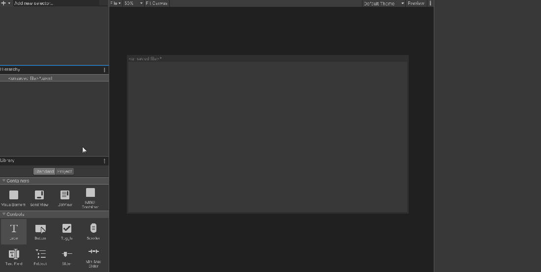
UI Builder
UI Builder is a way to visually create and edit UXML and USS files. It is also highly useful if you are creating your assets via code and want to mockup how something might look or to see what the proper syntax is for a style variable. Open the window by going to Window > UI Toolkit > UI Builder.
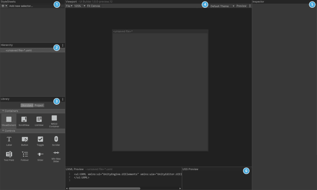
UI Builder is broken out into six different sections:
- StyleSheets: Manage the stylesheets and individual selectors that are used in this document. Style Sheets can be shared across multiple documents, thereby maximising reusability.
- Hierarchy: A list of all elements that are within the document.
- Library: Contains a list of standard elements that can be instantiated. The Standard tab contains UI Documents from Unity. The Project tab contains UI Documents created in your project.
- Viewport: Visual of the UI document.
- Inspector: Contains modifiable attributes and style properties for the element currently selected in the hierarchy or StyleSheet sections.
- Code Preview: Displays the UXML and USS code that UI Builder is generating based on your decisions.
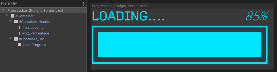
Design 1 – Loading Progress Bar
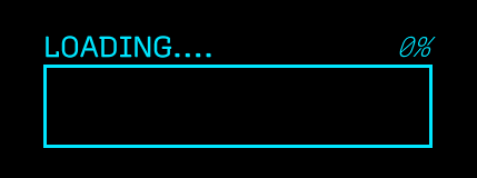
Now it is time to create the first progress bar. This is a basic square progress bar made entirely using properties with UI Toolkit. In other words, there is no sprites just yet. Here is what you will be building:
Inside UI Builder, click on the first item in the Hierarchy window, called «unsaved window».uxml. This pulls up the base properties in the Inspector window. Set the width to 360 and the height to 130.
Drag a VisualElement from the library and drop it in the Hierarchy window. Click on it to pull up the properties. Set the following:
- Name: Container
- Size > Width: 350 px
Drag another VisualElement into the hierarchy window and make it a child of the Container. Set the following properties:
- Name: Container\_Header
- Flex > Direction: row
- Text > Font: Recursive
- Text > Size: 25px.
Add a Label control as a child of Container\_Header. Set the following properties:
- Name: txt\_Loading
- Text: LOADING….
- Flex > Grow: 1
- Font Style: Bold
- Text > Color: # 00E6FF
Add a Label control as the last child of Container\_Header. Set the following properties:
- Name: txt\_Percentage
- Text: 0%
- Font Style: Italic
- Text > Color: # 00E6FF
Add another VisualElement as the last child of Container. Set the following properties:
- Name: Container\_Bar
- Size > Height: 75px
- Border > Color: # 00E6FF
- Border > Width: 3px
Add one final VisualElement as the last child of Container\_Bar. Set the following properties:
- Name: bar\_Progress
- Size > Height: 100%
- Size > Width: 0%
- Margin & Padding > Margin: 10px
- Background > Color: # 00E6FF
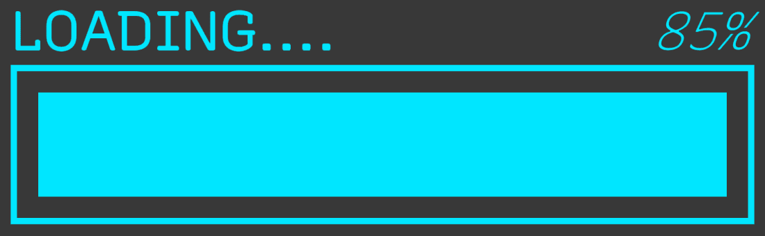
Save your UXML document by going to File > Save As at the top of the Viewport section and name it Progressbar\_Straight\_Border. You should now have a window that looks like this if you were to set the width of bar\_Progress to 100% and txt\_Percentage to 85%:
Note: This tutorial is using In-line styles. If you’d like to organize a bit more using stylesheets or learn more about the post common properties, check out Create the stylesheet section in Create an in-game Inventory UI with UI Toolkit.
Note: The layout engine that UI Toolkit uses is the open source project called Yoga, which implements a subset of Flexbox. Flexbox is an HTML/CSS based layout system. A useful guide to Flexbox can be found here.
Design 1 – Add the UI to the game
Before you can add this to your game, you will need a full screen UI Container. In UI Builder, go to File > New. Click on .uxml in the Hierarchy window and enable Match Game View. This property will automatically set the width and the height of the UI to match the game window.
Next, you will add the progress bar to the center of the screen. In the Library section, click on the Project tab and expand the tree view until you find Progressbar\_Straight\_Border.uxml. Drag it into the Hierarchy. Click on it, and set the following properties:
- Flex > Grow: 1
- Align > Align Items: center
- Align > Justify Content: center
Save the file and call it LoadScreen.
Note: You may want to have the loading progress bar appear on top of a nice full screen image. To do this, first add a new VisualElement to the LoadScreen root and set Background > Image to your sprite. Progressbar\_Straight\_Border should be a child of your new VisualElement.
Display the progress bar in your scene
UI Toolkit comes with a new component/game object type called UI Document. Add it to a new, empty scene by going GameObject > UI Toolkit > UI Document. Rename it to ProgressBar.
In your scene, you should now see a game object with a UI Document component. The Component has three properties:
- Panel Settings: The panel is the root VisualElement that all UI Documents are attached to. It is what handles drawing the UI in the Scene at runtime. The Panel Settings file has various properties that you can set which impact runtime.
- Source Asset: Reference to UXML files that should be associated with the panel (root VIsualElement). You can have multiple of these.
- Sort Order: Specifies the order that this UI document will show up in relation to other UI documents that are part of the same PanelSettings or UI Document parent.
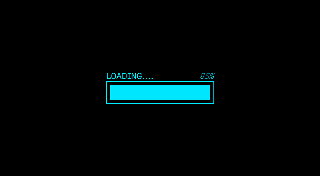
There is only one property to change. Set Source Asset to LoadScreen. Push play and you should now see a static progress bar on the bottom of your Game window.
Design 1 – Animate the progress bar
I have found that there are two main ways to animate the new UI, depending on the complexity of what you need to do. The first is with the experimental animation functionality that comes built in with UI Toolkit. The second is using a free (but with a paid option) tool called DOTween. For this tutorial, you will use DOTween as you will be animating both the scale of the bar and the text value of the label.
Note: At the time of writing this tutorial the experimental animation features currently only support Layout, Position, Rotation, Scale, Size and animating float style properties. You can read more on the API here.
Create a new script called LoadingProgressBarAnimation. This is where you will write the code for animating both of your progress bars. Add the following new references:
using UnityEngine;
using UnityEngine.UIElements;
using DG.Tweening;
Next add some global variables and a Start method:
private VisualElement m_Root;
private VisualElement m_LoadingProgressBar;
private Label m_LoadingPercentageText;

void Start()
{
    //Grab a reference to the root element that is drawn
    m_Root = GetComponent<UIDocument>().rootVisualElement;

    //Search the root for the two dynamic elements that need to be animated
    m_LoadingProgressBar = m_Root.Q<VisualElement>("bar_Progress");
    m_LoadingPercentageText = m_Root.Q<Label>("txt_Percentage");
}
Start is doing two important things:
- m\_Root is getting the root Visual Element from the UIDocument component for easy access later.
- m\_ProgressBar and m\_PercentageText references are set by querying m\_Root based on the element type and name.
Note: You can use either Q or Query to search for a specific element within the hierarchy. Providing either the type or the name is optional. You can also return the first result of the query by appending .First() at the end and the last by appending .Last(). For example: m_ProgressBar = m_Root.Q<VisualElement>("bar_Progress").First();
Finally, add a new AnimateLoadingBar() method, with the following code:
private void AnimateLoadingBar()
{
//Grab the final width of the progress bar based on the parent and
//remove 25px to account for margins
float endWidth = m_LoadingProgressBar.parent.worldBound.width - 25;
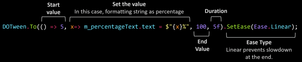
DOTween.To(() => 5, x=> m_LoadingPercentageText.text = $"{x}%",
100, 5f).SetEase(Ease.Linear);
DOTween.To(() => m_LoadingProgressBar.worldBound.width, x =>
m_LoadingProgressBar.style.width = x, endWidth, 5f).SetEase(Ease.Linear);
}As mentioned before, DOTween is a very versatile way to animate objects in C#. Calling DOTween.To() gives you the ability to animate anything, all you need to do is provide a few parameters. Here is a deeper look at the text animation:
The difference in the ProgressBar animation is minor, in that instead of setting the text property you are changing the width of the visual element. Duration and ease are the same.
Push play and you should see a full animated bar start after a couple of seconds:
Design 2 – Circular progress bar
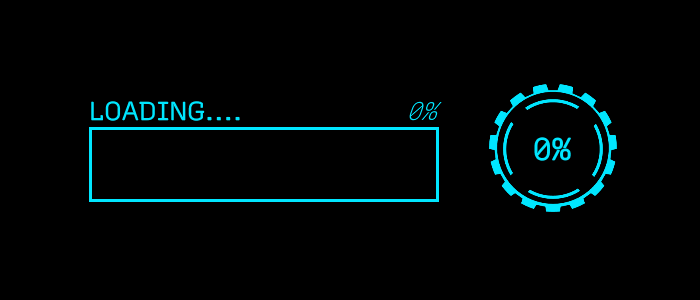
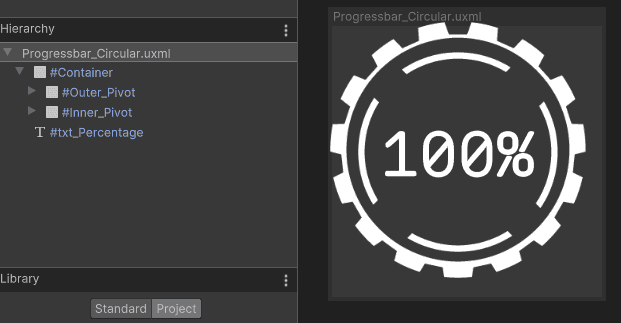
Now that you have gotten a taste of designing and animating a simple progress bar, lets kick it up a notch. In the second half of this tutorial, you will design a circular progress bar with three animations and hook it up to an in-game animation so that it triggers when the player takes a specific action. Here is what the progress “bar” will look like:
Open UI Builder and create a new UI Document by going to File > New. Add a new VisualElement and set the following:
- Name: Container
- Align > Align Items: Center
- Align > Justify Content: Center
- Size > Width & Height: 128px
Drag another VisualElement and make it a child of the Container. Set the following properties:
- Name: Outer\_Pivot
- Size > Width & Height: 1px
Note: A pivot point in UI Toolkit defaults to the top left corner. As of the writing of this tutorial, there is no way to change that pivot point. To get around this, any element that you want to rotate from a different pivot needs to have a manual pivot set by creating a parent element and positioning the animated element relative to it. If you did not add the pivot parent, then the images would each pivot from the top corner, rather than center.
Drag another VisualElement and make it a child of Outer\_Pivot. Set the following properties:
- Name: Outer\_Image
- Position > Left & Top: -64px
- Flex > Shrink: 0
- Size > Width & Height: 128px
- Background > Image: OuterCircle
Drag another VisualElement and make it a child of the Container. Set the following properties:
- Name: Inner\_Pivot
- Size > Width & Height: 1px
Making Inner\_Pivot a peer of Outer\_Pivot will enable you to animate the elements it differently. If you were to instead make Inner\_Pivot a child of Outer\_Pivot, it would inherit any animations that applied to Outer\_Pivot. This could be useful in some scenarios, but not for this design.
Drag another VisualElement and make it a child of Inner\_Pivot. Set the following properties:
- Name: Inner\_Image
- Position > Left & Top: -50px
- Flex > Shrink: 0
- Size > Width & Height: 100px
- Background > Image: InnerCircle
Add a Label and make it a child of Container. Set the following properties:
- Name: txt\_Percentage
- Text: 0%
- Position > Position: Absolute
- Size > Width & Height: 128px
- Text > Font: Recursive
- Text > Size: 30px
- Text > Align: center and middle
Save the file as Progressbar\_Circular. You should now have a window that looks like this:
Design 2 – Add the UI to the game
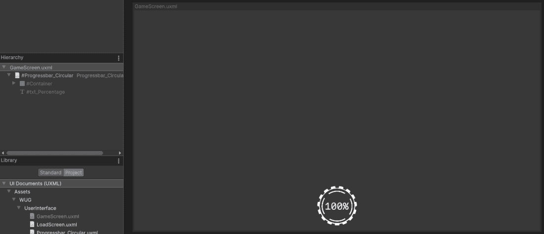
Once again, you will need a full screen UI Container. In UI Builder, go to File > New. Click on «unsaved window».uxml in the Hierarchy window and enable Match Game View.
Next, you will add the circular bar to the bottom of the screen. In the Library section, click on the Project tab and expand the tree view until you find Progressbar\_Circular.uxml. Drag it into the Hierarchy. Click on it, and set the following properties:
- Flex > Grow: 1
- Align > Align Items: center
- Align > Justify Content: bottom
- Margin & Padding > Margin > Bottom: 20px
Save the file and call it GameScreen.
Hop back into your scene and click on the ProgressBar game object. This is where the UI Document component and CircularProgressBarAnimation script live. Set the UI Document > Source Asset reference to GameScreen.
Design 2 – Hook up the progress bar to an existing animation
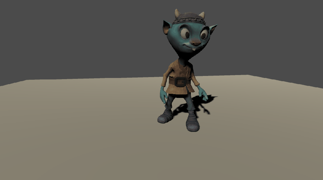
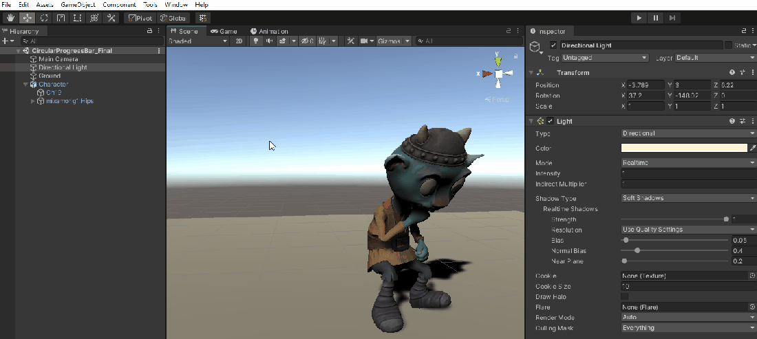
Open the CircularProgressBar\_Start scene located under Assets > WUG > Scenes. The scene is minimal and comes with a character who is setup to drum. Push play to see the animation workflow:
Note: You are probably wondering why you are looking at a fantasy character who is drumming. The short answer? Because he is adorable, and I thought drumming was a fun action to watch him do. I used Adobe’s Mixamo site for both the character and the animations.
As you can see, when the “Drum” trigger is enabled, the Animation Controller has three different animations that it plays. For this scenario, you will hook the Circular Progress Bar to appear, run and disappear during the “Drum” animation only. This can be achieved by using Animation Events.
Before you can add the Animation Event, you first need a new method for it to call. Animation Events can only call methods that are part of MonoBehaviors that are on the Game Object as the Animation. In this case, the tutorial project came with a CharacterController class that is on the Character Game Object. Open it, and add the following code:
private void AnimateProgressBar()
{
    //Gets a reference to the "Drum" clip on the controller
    AnimationClip clip = m_AnimatorController.runtimeAnimatorController
       .animationClips.Where(x => x.name.Equals("drumming")).FirstOrDefault();

    //Call the method that controls the circular animations
    CircularProgressBarAnimation.Instance.AnimateCircularProgressBar(clip == null ?
       5f: clip.length);
}
AnimateProgressBar searches the Animator Controller’s runtime animation clips for a reference to the “drumming” clip. The information is then used to pass the length into the Circular Progress Bar so that DOTween can use it.
The project also comes with a CircularProgressBarAnimation class that inherits from MonoBehaviour. The current behavior mirrors the setup of LoadingProgressBarAnimationin that it gets references to UI Document and root visual element. Open it and add a method stub (you will fill this in shortly):
public static void AnimateCircularProgressBar(float duration) { }Finally, you will add a reference to CharacterController.AnimateProgressBar() directly in your animation:
- Open the Animation window by going to Window > Animation > Animation.
- In the Hierarchy window, select Character game object. This will populate all of the associated animations as a drop down in the Animation Window.
- Select drumming in the dropdown.
- On the first keyframe, click the Add Event button. Unity will add a tall square-ish looking item at the top of the Animation.
- Click the new event icon. In the inspector window, set the Function to AnimateProgressBar.
Design 2 – Animate the progress bar
As I mentioned above, this progress bar will have three distinct animations all tied to the progress of the Drum clip:
- Percentage Text: Goes from 1% to 100%.
- Outer Ring: Quickly pivots around the center clockwise.
- Inner Ring: Slowly pivots around the center counterclockwise.
Additionally, the progress bar will only become visible while animating and will hide from the screen once complete. Add the following global methods and update Start to set the references and disable the m\_Root’s visibility on load:
private Label m_PercentageText;
private VisualElement m_OuterPivot;
private VisualElement m_InnerPivot;

private void Start()
{
    //Grab a reference to the root element that is drawn
    m_Root = GetComponent<UIDocument>().rootVisualElement;

    //Grab progress bar references
    m_PercentageText = m_Root.Q<Label>("txt_Percentage");
    m_OuterPivot = m_Root.Q<VisualElement>("Outer_Pivot");
    m_InnerPivot = m_Root.Q<VisualElement>("Inner_Pivot");

    //Display the view of the panel
    m_Root.style.visibility = Visibility.Hidden;
}
Next, add a new Coroutine which will animate the UI:
private IEnumerator AnimateUI(float duration)
{
    //Reset the text
    m_PercentageText.text = "1%";

    //Toggle visibility on
    m_Root.style.visibility = Visibility.Visible;

    //Set the tweens
    Tween outerTween = DOTween.To(()
        => m_OuterPivot.worldTransform.rotation.eulerAngles,
        x => m_OuterPivot.transform.rotation = Quaternion.Euler(x),
        new Vector3(0, 0, 360), 5 / 0.5f)
        .SetEase(Ease.Linear).SetLoops(-1);

    Tween innerTween = DOTween.To(() =>
        m_InnerPivot.worldTransform.rotation.eulerAngles,
        x => m_InnerPivot.transform.rotation = Quaternion.Euler(x),
        new Vector3(0, 0, -360), duration / 0.5f).SetEase(Ease.Linear).SetLoops(-1);

    DOTween.To(() => 5, x => m_PercentageText.text = $"{x}%", 100, duration)
        .etEase(Ease.Linear).OnComplete(() =>
        { outerTween.Kill(); innerTween.Kill(); });

    //Wait until tweens finish (+1 extra second for display purposes)
    yield return new WaitForSeconds(duration + 1f);

    //Disable the visiblity
    m_Root.style.visibility = Visibility.Hidden;
}
The AnimateUI Coroutine does three major things:
- Resets the text on m\_Percentage and toggles the visibility of the whole bar on.
- Instantiates the three Tweens with the appropriate parameters. The OuterPivot and InnerPivot tweens are rotating in a circle. InnerPivot is told to go counterclockwise by providing a -360 z parameter in the Vector3.
SetLoopsis telling the Tween how many times to loop with \-1 meaning “infinite”. The last new concept introduced is theOnComplete()method, which in this case is telling the outerTween and innerTweens to stop. If you were to take the OnComplete out, you would see the text hit 100% but the inner and outer images would continue to rotate.
- Waits one second longer than the Tweens so that the player can see the 100% result prior to the progress bar disappearing from the screen.
The last thing you need to do is start the coroutine. Add StartCoroutine(AnimateUI(duration)); to to AnimateCircularProgressBar. Push play and you should see the progress bar appear when he starts to drum.