Use style transitions to animate a menu with UI Toolkit

Note: This tutorial is the second part of a 2-part series. Part 1, Design an interactive game UI with Figma, covers the basics of using the free tier of Figma to rapidly prototype a new main menu design. You can skip the first tutorial if you do not want to learn about Figma.
Including animations in your user interface can take it to the next level and really make it pop. This tutorial teaches you how to use style transitions to animate your UI. It includes very minimal C# code to help stagger the animations, rather than having them all run at once. By the end, you will have the first screen in the Design an interactive game UI with Figma created and animated in Unity via UI Toolkit.
Learning Outcomes
In this tutorial you’ll learn about advanced UI Toolkit features, such as how to:
- Import and use custom fonts
- Define and use stylesheet variables
- Use transition properties to animate, including registering event listeners in C#
Prerequisites
- You should have Unity 2021.2 or later to follow along with this tutorial.
- This tutorial assumes you have basic knowledge of Unity and UI Toolkit.
Resources
Getting Started
This tutorial assumes you have basic knowledge of UI Toolkit and UI Builder. If you do not, please check out Create a runtime inventory UI with UI Toolkit or Design a grid style inventory window with UI Toolkit, which go over the basics.
Unlike many of the other tutorials on this site, this one does not come with a starter project. Instead, you’ll need to create a new Unity 2021.2 or later project. Once done, do the following to setup the project:
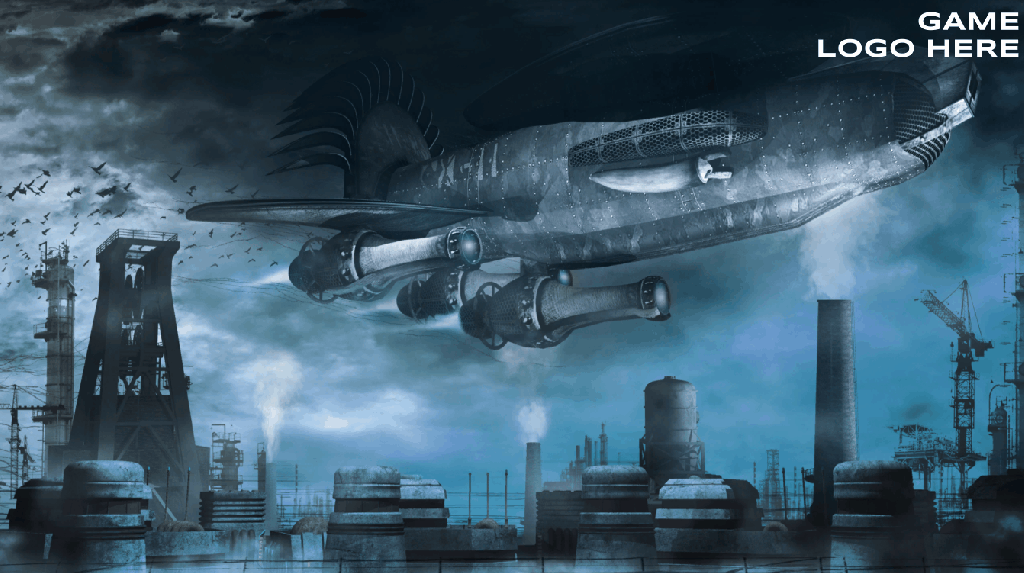
- Download the Flying machine over the factory background image.
- Name it background and import it into your project under a new Assets/Sprites. folder.
- Download the Syncopate font and import both files into your project under a new Assets/Fonts folder.
Select background and change the following properties:
- Texture Type: Sprite (2D and UI)
- Generate Physics Shape: False
Select both fonts and do the following:
- Right click to pull up the menu. Select Create \> Text \> Font Asset.
- Select the Syncopate-Regular SDF asset and under Font Weights, set 700 – Bold to Syncopate-Bold SDF.
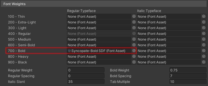
Note: Setting Synocopate-Bold SDF to the 700 – Bold property of the regular asset will ensure that the correct weight is applied to the font when you change the weight in UI Toolkit.
Setup the Scene
Sometimes UI Builder shows a different appearance then what will really render in your game. The best way to avoid a sudden shock of a mismatch is to setup the scene from the start and keep an eye on how your design is progressing. So, rather than waiting until the end lets have you setup the foundation now.
In the project explorer, add four new assets:
- Create > C# Script and name it UserInterfaceController.
- Create > UI Toolkit > Stylesheet and name it MainScreen.
- Create > UI Toolkit > UI Document and name it MainScreen.
- Create > UI Toolkit > Panel Settings Asset and name it MainPanelSettings.
Select MainPanelSettings and change Scale Mode to Scale with Screen Size.
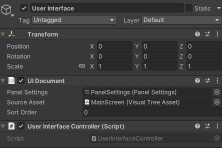
Next, hop over to your Hierarchy tab and add a new UI Document game object to the scene (UI Toolkit > UI Document). Name it User Interface. Set the following properties:
- Panel Settings: MainPanelSettings
- Source Asset: MainScreen.uxml
Add UserInterfaceController as a component.
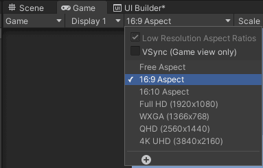
Finally – the last thing you’ll do is set the aspect ratio of the Game View to 16:9.
Note: As of the writing of this tutorial, Visual Studio has a bug which prevents UXML and USS files from showing up in the project explorer unless you have a C# script. So, if you run into this in another project make sure to add an empty C# script and all should work.
Create the Stylesheet
There are several standard styles that will be used in this project. Fortunately, UI toolkit USS supports variables (also known as custom properties). A variable allows you to define a value, such as your font or color schemes, that you can then point to from other style properties.
Open MainScreen file in your IDE of choice and add the following code:
:root {
    /* Variables */
    --color-1: rgba(0, 0, 0, 0.75);
    --color-2: rgb(108, 160, 195);
    --font-size-h1: 35px;
    --font-size-h2: 30px;
    --font-size-h3: 25px;
    --background-img: url('project://database/Assets/Sprites/Background.jpeg');

    /* Root Properties */
    -unity-font-definition: url('project://database/Assets/Fonts/Syncopate-Regular%20SDF.asset');
    color: var(--color-2);
}
The :root selector matches the root element of the tree. This means that values, such as a font color (color: var(--color2)), will apply to all visual elements, unless specifically overridden. Defining variables in the root selector is the equivalent of having a global scope – meaning all other styles on this stylesheet will be able to reference them.
Variable definitions follow the standard format of a property, except they require the -- prefix at the beginning. For example, the code above has two color variables. color-1 is black with a 75% opacity value, which will give it a slight transparent look. color-2 is a light blue.
The var() function is used to reference a variable. For example, color: var(--color-2) is setting the default text color of all elements to the light blue specified in the variable earlier.
Create the Navigation Bar
In this section, you’ll design the navigation bar that will transition to different options depending on if the user is on the main menu or the settings menu. Go to Window \> UI Toolkit > UI Builder to open the UI Builder window. Open MainScreen.UXML and add the MainScreen.USS as a stylesheet.
Note: It is possible that UI Toolkit may have issues recognizing the :root styles that you setup in the section above. If you run into this, try setting background-image and/or font asset in UI Builder on the root directly and then copy the path over to your variable.
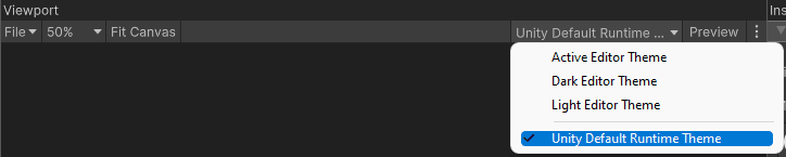
Before jumping in, it’s best to change the theme to Unity Default Runtime Theme, as it will default to editor one. In the Viewport section, select the Active Editor Theme drop down and change it to Unity Default Runtime Theme.
Now, do the following:
- In the Hierarchy section, click on MainMenu.UXML and enable Match Game View in the Inspector.
- Add a child VisualElement named Container.
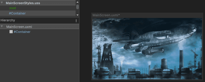
- In the Stylesheet, add a new style called #Container. Set the following properties:
#Container {
    flex-grow: 1;
    background-image: var(--background-img);
    flex-direction: row;
}
You should now see a the background image take up the full window space.
Layout the Navigation
This tutorial is only focusing on creating the main screen, so let’s have you setup that navigation now. In UI Builder, do the following:
- Add a Visual Element as a child of Container. Name it Menu.
- Add a Visual Element as a child of Container. Name it Content.
- Add a Visual Element as a child of Menu. Name it Navigation.
- Add a Visual Element as a child of Navigation. Name it MainNav.
- Add a Visual Element as a child of Menu. Name it DecorativeBar.
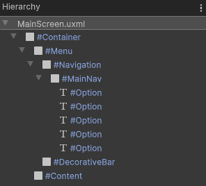
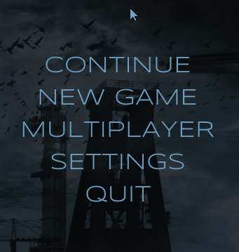
Now you’ll setup the hierarchy of MainNav:
- Add a Label as a child and name it Options. Set the text to CONTINUE.
- Duplicate the Options element four times, for a total of five children under MenuContent.
- Set the text values for each of the remaining four to: NEW GAME, MULTIPLAYER, SETTINGS, and QUIT.
Your hierarchy should now look like this:
Set the Styles
Now that you’ve got the structure laid out, it’s time to get some styles setup. Open the USS file and add the following:
#Menu {
    width: 28%;
    flex-direction: row;
}

#Menu > VisualElement {
    background-color: var(--color-1);
}

#Navigation {
    flex-grow: 1;
    align-items: center;
    justify-content: center;
    display: flex;
    font-size: var(--font-size-h2);
    -unity-text-align: upper-center;
}

#DecorativeBar {
    width: 5px;
    margin-left: 5px;
    margin-right: 5px;
}
There are a few different selectors that you can use when setting up your styles. Here’s a crash course on what you need to know:
- # means that the style will apply to any elements that match the same name.
- . is a class selector, and will apply to any elements that have the class referenced. (This has not been used yet but will be shortly.)
- No prefix means that the style applies to any elements of the same type.
- \> is a way to traverse the hierarchy and apply the style down to specific descendants.
For example, #SettingsContent > #Header means that the style will only apply to a direct descendant of SettingsContent that is also named Header.
Note: You can also use \, which is a wildcard and means ‘apply to any elements’. For example, #SettingsContent > would apply the style to any direct descendants of SettingsContent. Read more about USS Selectors here.
Animate the hover state
If the player was to hover over any of the menu options, they would not get any visual feedback. Using transition properties, you’ll add behavior so that the hovered label changes in two ways – the font size will increase, and the color will change to white. Transition properties enable you to animate changes in style properties any time the value changes. There are four properties that you can set:
transition-delaydefines how long to wait between the time the property is changed and when the transition should begin.
transition-durationdefines how long the duration should take to run.
transition-propertyspecifies the style properties that the transition should be applied to.
transition-timing-functionare where you set the ease type that the transition should follow.
Note: transition-property will default to all properties if you do not set it in the stylesheet.
Not every style property can be animated. As of the writing of this tutorial, UI Toolkit categorizes each style into one of three categories:
- Fully animatable, which means that the value will transition gradually from the original value to the new one.
- Discrete animation, which changes in a single step from the original value to the new one.
- Not animatable, which does not adhere to transition properties at all.
Most properties fall into the full or discrete buckets. In this case, font color is considered fully animatable and the font-size is discrete. This means that you should see the color fade in (depending on the duration) and the font-size will jump to the last step.
Note: You can find the full list of properties and their animation category here.
Alright, now it’s time to setup the project! Open the stylesheet and add the following code:
#Option {
    transition-duration: 0.25s;
    transition-timing-function: ease-out-back;
}

#Option:hover {
    color: white;
    font-size: var(--font-size-h1);
}
As you can see, there’s not very much code needed to do this. There are two main aspects to the code above:
transition-durationmakes sure all transitions run for 0.25 seconds.
Transition-timing-functionusesease-out-backto add a little ‘easing spice’ to the transition.
:hovera pseudo class that ensures that the style will only be applied if the element is being hovered over.
Note: There are several types of pseudo classes, including active, inactive, and focus. Read more about pseudo classes here.
There are many types of eases that you can pick from. Here’s a handy reference that I use to remember what each ease does.
Push play and hover over the elements to see them animate.
Create the Content
Now that the navigation is finished, it’s time to setup the content area. It’ll consist of a header which has placeholder text for the game logo, and a body area that has two carousel style widgets. Here’s what you’ll have at the end of this section:
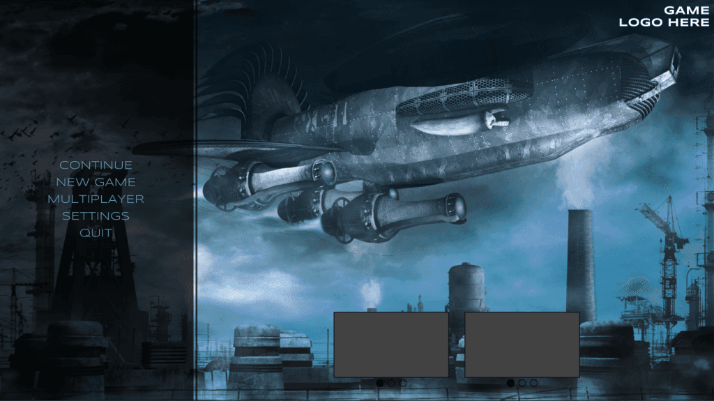
Let’s start with creating the styles that you’ll use first. Hop over to the USS file and add the following styles:
#Content {
    align-items: stretch;
    flex-grow: 1;
    margin: 10px;
}

#Content #Header {
    width: 100%;
    font-size: var(--font-size-h2);
    -unity-font-style: bold;
    color: rgba(255, 255, 255, 255);
    -unity-text-align: upper-right;
}

#Body {
    flex-grow: 1;
    justify-content: center;
    flex-direction: row;
    width: 100%;
    align-items: flex-end;
}

#WidgetContainer {
    width: 300px;
    height: 200px;
    border-color: rgba(0, 0, 0, 255);
    margin: 20px;
}

#Image {
    border-width: 2px;
    height: 90%;
    border-color: var(--color-1);
    background-color: rgba(66, 66, 66, 255);
}

#NavContainer {
    height: 10%;
    flex-direction: row;
    margin: 5px;
    align-items: center;
    justify-content: center;
}

#Selector {
    border-width: 2px;
    border-color: var(--color-1);
    width: 20px;
    height: 20px;
    border-radius: 50px;
    margin: 5px;
}

.selector-filled {
    background-color: var(--color-1);
}
Create the Elements
In UI Builder, do the following:
- Add a Label as a child of Content. Name it Header. Set the text to GAME LOGO HERE, adding a carriage return after the word GAME so it is on two lines.
- Add a Visual Element as a child of Content. Name it Body.
- Add a Visual Element as a child of Body. Name it WidgetContainer.
- Add a Visual Element as a child of WidgetContainer. Name it Image.
- Add a Visual Element as a child of WidgetContainer. Name it NavContainer.
- Add a Visual Element as a child of NavContainer. Name it Selector. Duplicate it two times, for a total of three.
- Add the
.selector-filledclass to the first Selector element.
- Duplicate WidgetContainer so that you have two of them.
Animate the Game Start
Now that the navigation and content areas are setup, it’s time to animate them. This will simulate what the player sees when the game first loads. Here’s how it’ll work:
- The
Navigationvisual element will transition from an opacity of 0 to 100, giving it the effect of a fade in.
- Once that is done, each of the
MainNav.Optionselements will transition their opacity from 0 to 100, but only after the previous sibling has completed.
- Finally, the
WidgetContainerwill slide in from the bottom, using theTranslateproperty.
Here’s what the result will look like:

This will mostly be handled via styles. Update #Menu and #WidgetContainer with the highlighted properties and add .pop-animation-hide:
#Menu {
    width: 28%;
    flex-direction: row;
    transition-property: opacity;
    transition-duration: 0.75s;
    transition-timing-function: ease-out-back;
}

#WidgetContainer {
    width: 300px;
    height: 200px;
    border-color: rgb(0, 0, 0);
    margin: 20px;
    translate: 0 254px;
    transition-duration: 0.75s;
    transition-delay: 0.75s;
    transition-timing-function: ease-out-back;
}

.pop-animation-hide {
    opacity: 0;
}
The intention with this style is to have .pop-animation-hide on all elements that should be hidden by default and animate in. Head back over to UI Toolkit and add the class to Menu and all the Option elements. You should see them disappear on the design. This is because their opacity is now set to 0.
Great! Now that the styles are setup, it’s time to trigger the animation via C#. Hop over to the UserInterfaceController script and add the following global references and methods:
private VisualElement _menu;
private VisualElement[] _mainMenuOptions;
private List<VisualElement> _widgets;

private const string POPUP_ANIMATION = "pop-animation-hide";
private int _mainPopupIndex = -1;

private void Awake() {
    var root = GetComponent<UIDocument>().rootVisualElement;
    _menu = root.Q<VisualElement>("Menu");
    _mainMenuOptions = _menu.Q<VisualElement>("MainNav").Children().ToArray();
    _widgets = root.Q<VisualElement>("Body").Children().ToList();
}

private IEnumerator Start() {
    yield return new WaitForSeconds(2f);

    _menu.ToggleInClassList(POPUP_ANIMATION);
}
As you can see, this code is setting references to key parts of the UXML file that you set earlier. Perhaps the most interesting part of this is that Start has been transformed to an IEnumerator, which effectively runs like a coroutine. Setting yield return new WaitForSeconds(2f); prevents the animation from starting the section the game loads. By calling _menu.ToggleInClassList(POPUP_ANIMATION); , you’re telling UI Toolkit to disable the class which starts the transition of the opacity from 0 to 100.
Push play and you should only see the menu transition in. This is because there’s nothing in the code that removes the pop-unimation-hide from the option elements or that sets translate value for the widgets back to zero.
To do this you will register an event listener to the TransitionEndEvent, which fires when the transition has successfully finished. There are four transition events that you can listen for:
- TransitionStartEvent triggers after the transition delay has finished. In other words, if you have a delay of 1s, then the TransitionStartEvent would fire when the 1s has passed.
- TransitionRunEvent triggers when the transition is created (i.e., set to the list of running transitions).
- TransitionCancelEvent triggers if the transition is canceled.
- TransitionEndEvent triggers when the transition has successfully finished. If the transition is removed before completion, then the event will not fire.
Transition events trickle down. Which means that you can add a listener to the top-level visual element, such as Menu, and any transitions on the descendants, such as Option, will also cause that event to fire. You’ll use this to create an animation sequence. Head back over to the C# class and register a listener for the TransitionEndEvent in Awake and a new Menu_TransitionEnd method:
private void Awake()
{
    //Previous code above

    _menu.RegisterCallback<TransitionEndEvent>(Menu_TransitionEnd);
}

private void Menu_TransitionEnd(TransitionEndEvent evt)
{
    if (!evt.stylePropertyNames.Contains("opacity")) { return; }

    if (_mainPopupIndex < _mainMenuOptions.Length - 1)
    {
        _mainPopupIndex++;
        _mainMenuOptions[_mainPopupIndex].ToggleInClassList(POPUP_ANIMATION);
    }
    else
    {
        _widgets.ForEach(x => x.style.translate = new StyleTranslate(new Translate(0, 0, 0)));

    }
}
TransitionEndEvent will fire for any property, which means that the first thing you need to do verify that the property that has just finished is Opacity, the one that you are specifically animating. If it is, then the branching logic is evaluated. The first branch checks to see if all of the Options elements have had pop-animation-hide removed. Once they have, it’ll set the Translate position of all the Widgets to 0, thereby triggering their animation.
Since WidgetContainer is not a child of Menu, this will cause the chain of events to end, finishing up the animation sequence.
Note: The Widgets could have had a style on them as well. I went with changing the style property in code to show you that any change, be it via the stylesheet or C#, will cause the Transitions to happen.
Push play and you should now see the animation running perfectly!
Wrap Up – Challenge
That’s it! You should now have all the foundation needed to create your own awesome styles and animations with UI Toolkit. If you want to put your knowledge to the test, you can create the second settings screen that was designed in Part 1. Here’s some areas that could transition in:
- Hook up the Settings and Cancel buttons to swap between the main and settings menu. Have the whole panel fade out.
- For the individual settings items, have each one fly in from the right or the bottom, one after the other.
One final tip that can be helpful for this is to use TransitionEndEvent.currentTarget to check for the exact element that has the transition ending on it.