Design an interactive game UI with Figma
Note: This tutorial is the first part of a 2-part series. Once available, Part 2 will take the design from Figma and build/animate it in Unity using UI Toolkit.
Coming up with a good design for your game is incredibly difficult but instrumental in ensuring a cohesive and easy to use experience. There are many tools that you can pick from for mocking up new ideas. One of my favorites is Figma, which is a (primarily) web-based tool that lets you brainstorm, design, and prototype ideas – either solo or collaboratively in real time. In this tutorial you will learn the fundamentals of Figma while creating two game screens – the main and settings. By the end you will have enough knowledge to quickly prototype your own designs!
All features covered are available in Figma’s free tier.
Learning Outcomes
In this tutorial you will learn the basics of Figma, including how to:
- Use auto layout to organize and align elements
- Create reusable styles and components with variants
- Configure and run prototype workflows for interactivity
- Install plugins
Prerequisites
- Create a free Figma account.
Resources
Getting started
Go here to access the final project in Figma.
Figma organizes work into three buckets – At the top you have your account that you registered with. Each account can have multiple teams. A team is a grouping of projects – which is how you organize your work. Projects contain FigJam and Design files, which is where you will do the actual work. For this tutorial, you’ll use a single Design file.
Login to Figma and create a new Design file by clicking the \+ button next to the project. Choosing Design File. Once created, the browser will redirect you so you can start working.
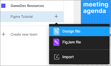
Note: FigJam files are for brainstorming – which is out of scope of this tutorial.
Install the Iconify plugin
There is an excellent plugin for Figma called Iconify which gives you easy access to over 100,000 open source icons. You’ll use the plugin later in this tutorial, so it’s best to get it installed now:
- In a new tab navigate to the Iconify plugin.
- Click the Install button, located on the top right of the page.
Note: Make sure to check the license for any icons that you use.
Brief overview of the design space
The Design file UI is made up of three areas that you’ll interact with frequently. They are the
- Top Bar: Contains the main design tools, main menu, and major actions such as sharing and activating the prototype workflows.
- Left Panel: Primary way you’ll organize and navigate various elements.
- Right Panel: Contains the properties that can be modified to alter the look and behavior of elements.
- Design Space: Where you’ll do most of the work.
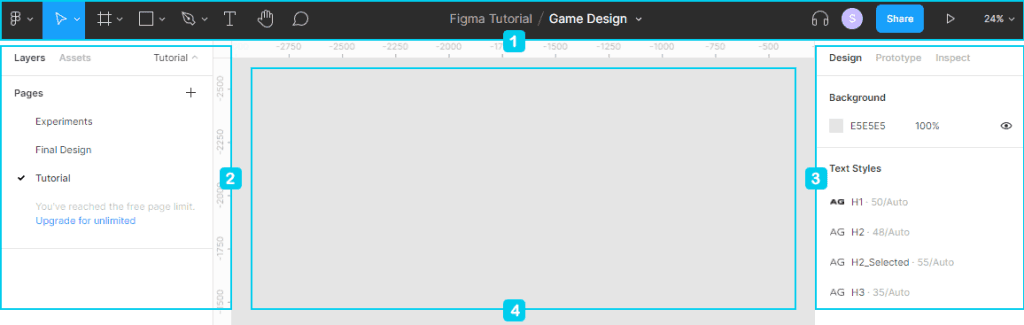
Top Bar
- Move tools which have Move and Scale.
- Region tools which have Frame and Slice.
- Shape tools which have Rectangle, Line, Arrow, Ellipse, Polygon, Star, and Image Upload (via the place image option).
- Drawing tools which have Pen and Pencil.
- Text
For the top bar we’ll focus on the icons on the left, starting with the pointer. These are your main design tools. Here’s what they do:
Left Panel
The left panel has layers, assets, and pages. Here’s the difference:
- Pages are a way to organize your design file.
- Layers has the hierarchical structure of all the elements in the design file.
- Assets are where reusable components are located.
Right Panel
As mentioned above, the right panel has Design, Porotype, and Inspect. Here’s what each does:
- Design displays all configurable properties that can be set to change the look and behavior of an element.
- Prototype contains properties for setting up interactions between user input and the elements.
- Inspect displays a rollup of all configured properties for a selected element. If nothing is selected, you will see any global styles that are available.
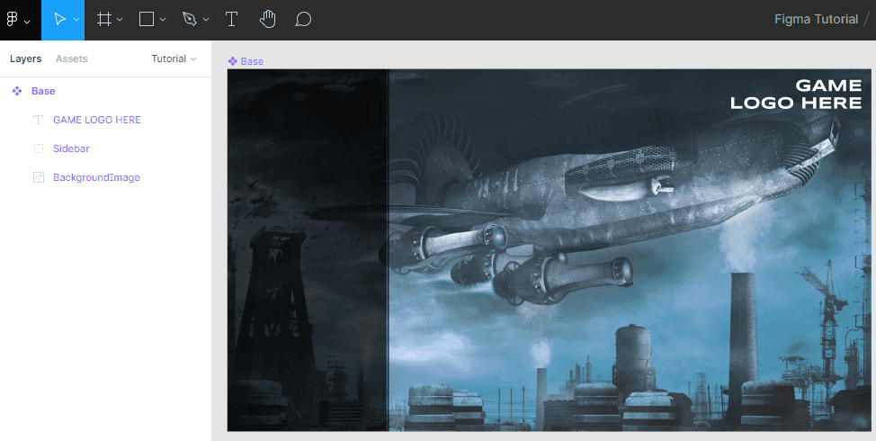
Create the base component
The base element is the first reusable component that you’ll create. A component is a template of an element that you can reuse across the designs. They are incredibly useful for creating visual styles that can be easily adjusted. Their are two main parts to a component:
- The main component, which is the base template where you define the properties.
- An instance, which is a linked copy of the main component.
The base component will be used by both the main menu and settings screen. Everything will be grouped under a Frame, which is a container for your design. As a result, Frames have extra functionality, such as Layout Grids, Auto Layout, Constraints, and more. They are considered a parent element, which means that they can control any child objects within it.
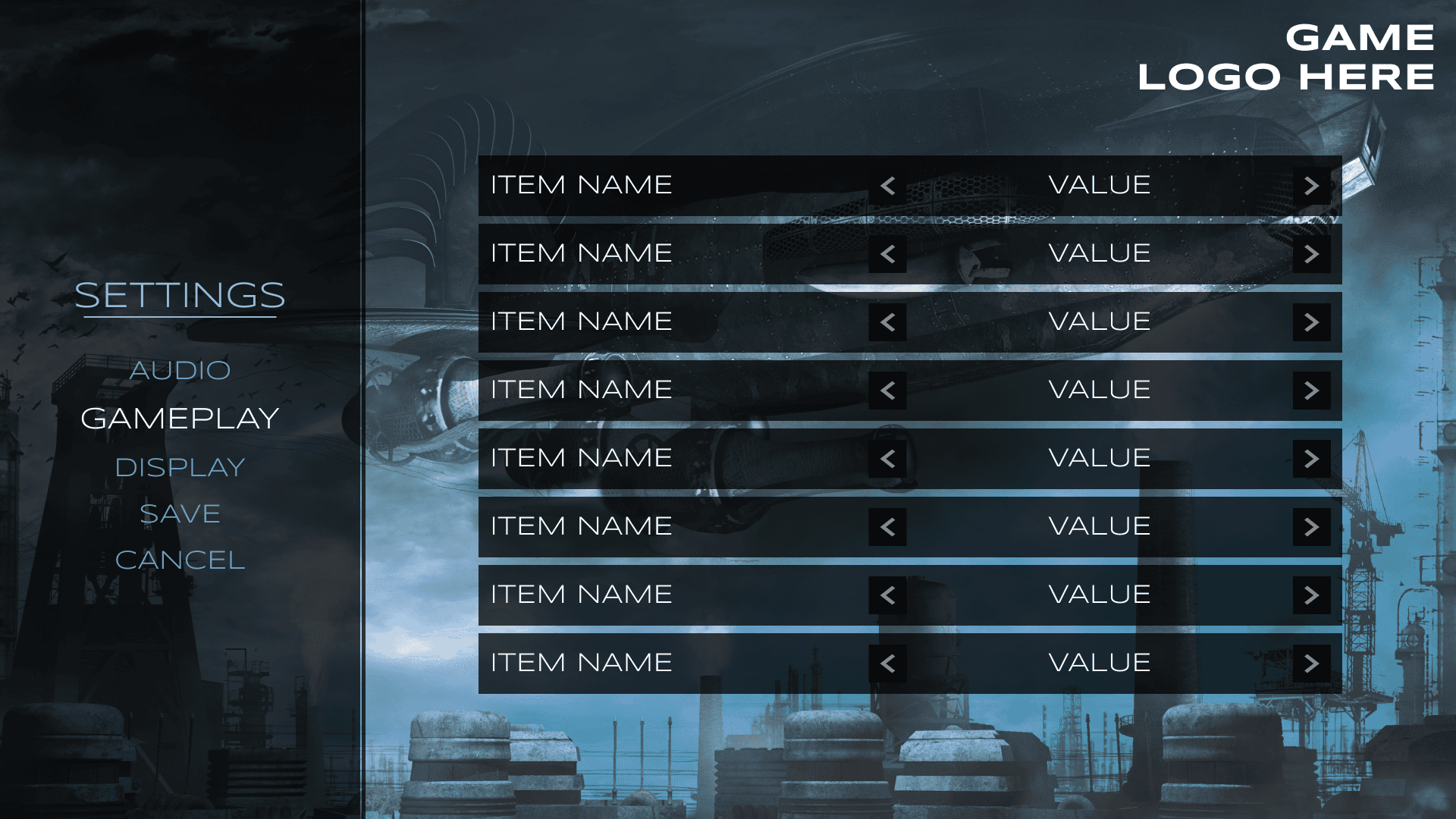
Here’s what the base component will look like:
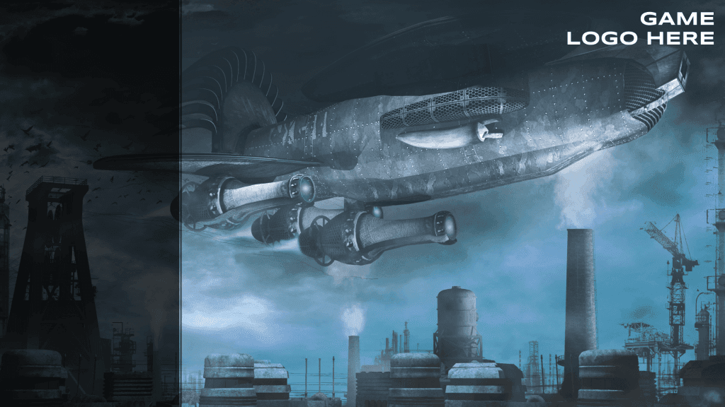
Note: The background image in this project is Flying machine over the factory by Melkor3D. Please review the licensing if you intend to use it beyond this tutorial.
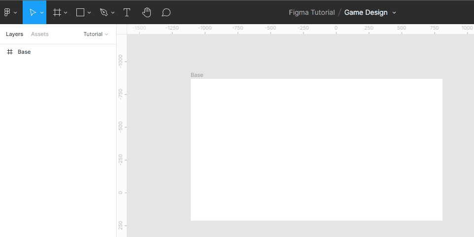
Add a new Frame by activating the Frame tool and click anywhere in the design space. Double click on the Frame 1 text header of the element and name it Base. Set the following properties, found on the design tab:
- Width: 1920
- Height:1080
Note: Make sure the element is selected if you do not see the properties.
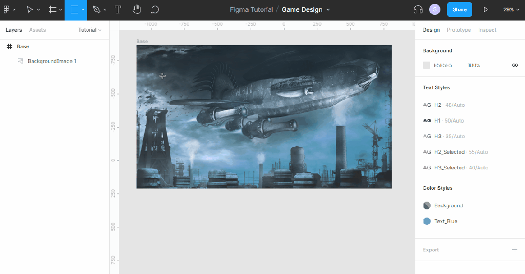
Next, you’ll need to set the background image. You have two options – drag and drop from a folder into the design space or use the Place Image option located in the Shape tools menu category. Once imported, make the image a child of the Base Frame and position it however you like. Rename it to BackgroundImage.
Use the Layers tab to organize the parent/child hierarchy via drag and drop.
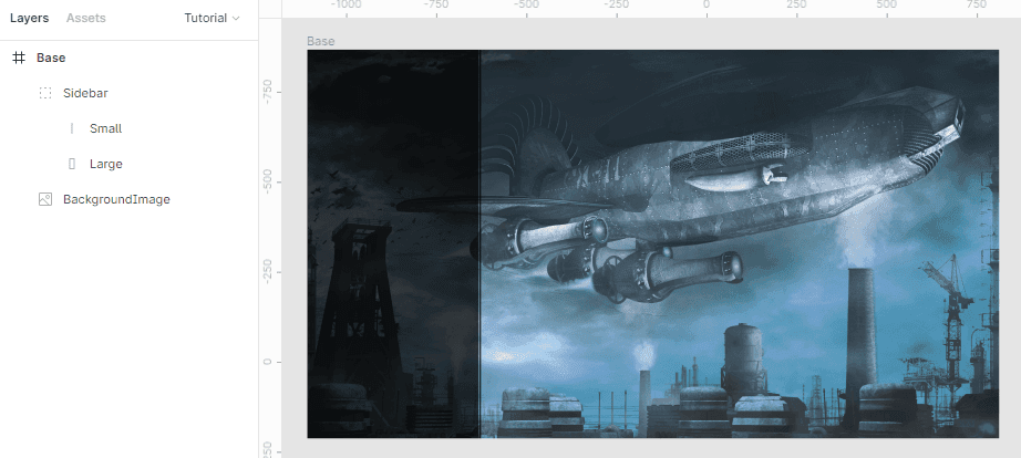
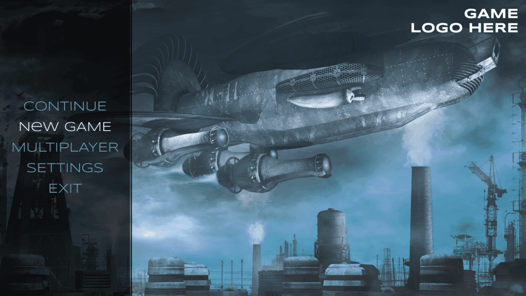
Create the sidebar
The left side of the design has space for a sidebar which consists of two black rectangles with a semitransparent background. Create the Large square first by activating the Rectangle tool, located in the Shape tools menu. Click inside Base. Change the name to Large and set the following properties:
- Position (x, y): 0: 0
- Width: 475
- Height: 1080
- Fill > Color: Black with 75% opacity
Note: Hover over any properties in Figma to see a tooltip.
Repeat the same process to create a smaller line, setting the following properties instead:
- Name: Small
- Position (x, y): 477, 0
- Width: 5
- Height: 1080
- Fill > Color: Black with 75% opacity
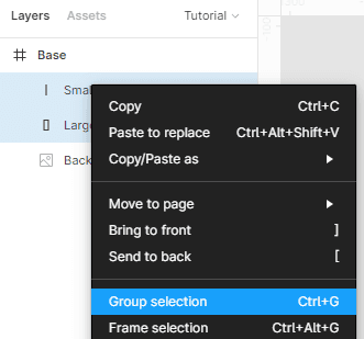
Both elements should be grouped together as they’re part of the same “Sidebar” design. Select both via the Layouts tab and right click to bring up the shortcut menu. Select Group selection and name it Sidebar.
Your design should look like this:
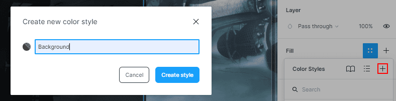
Create the background style
As my son would say, “Oh dear!” You’ve just set the same fill properties on two different elements. Black with 75% opacity happens to be a style that you’ll use even more throughout this design, so it makes sense to set it as an ‘official’ style. Select the Large rectangle so you see the properties on the design tab and do the following:
- Click the four dots to bring up the Color Styles menu
- Select the + button
- Set the name to Background
- Click Create Style
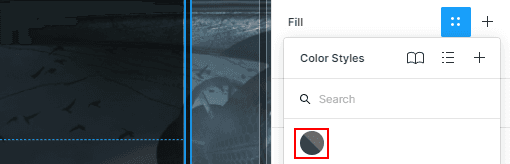
That’s it! You’ll now be able to use the same style across any of the elements you create. Fix the Small rectangle by selecting it once again. Click the four dots to bring up the Color Styles menu and pick the first circle, which is the newly created Background style.
Set the logo placeholder
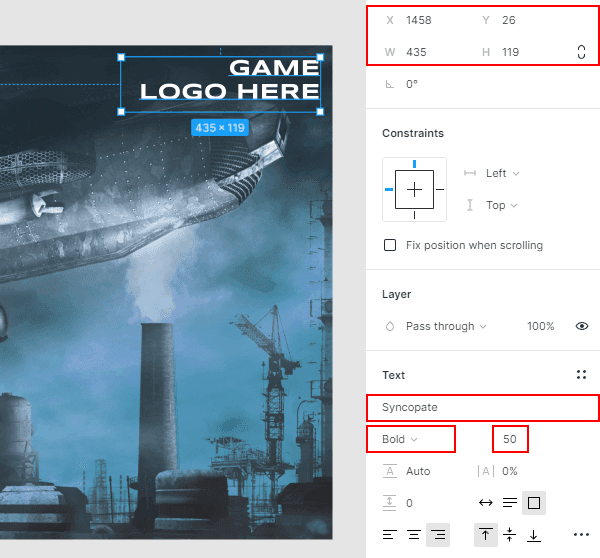
There’s one thing left to do for the Base element, which is add the placeholder text for the logo. Select the Text tool and click inside Base. Type GAME LOGO HERE, adding a line break after the word game, and set the following properties:
- Position (x, y): 1458, 26
- Width: 435
- Height: 119
- Font: Syncopate
- Font \> Weight: Bold
- Font \> Size: 50
Note: The Text element defaults to ‘auto width / height’, which prevent you from manually inputting values into the properties. This can be fixed by dragging the anchors of the element directly in the design space or by selecting “fixed size” in the text properties.
The font properties for the header are the first text style that you’ll create. Once again, click on the four dots, select the \+ button and name the style Header1.
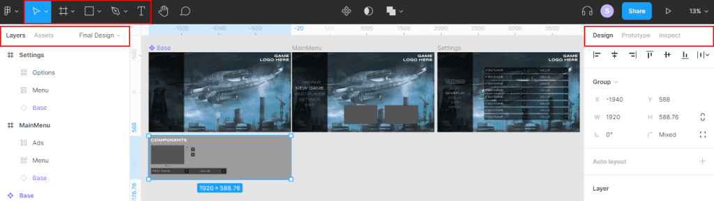
That’s it for the base element. Now it’s time to convert it to a component that you can create instances of. Via the Layout section, right click on Base and select Create Component. You should notice a change – main components have purple text and a dotted triangle icon.
Create the MainScreen
Now it’s time to make the first screen – which is the main menu that the player will land on. Do the following:
- Add a new Frame and name it MainScreen.
- Set the size (w, h) to 1920×1080.
- Click on the Assets tab on the left menu.
- Drag and drop the Base component into the MainScreen frame and set the position to 0,0.
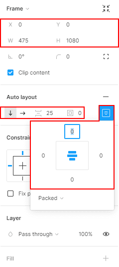
Next you’ll build the left menu. Add a new Frame as a child of MainScreen and name it MenuOptions. Set the following properties:
- Position (x, y): 0
- Width: 475
- Height: 1080
- Auto Layout: On (click the + button)
- Auto Layout > Space Between: 25
- Auto Layout > Padding: 0
- Auto Layout > Alignment: Middle Center
- Constraints & Resizing \> Width: Fixed
- Constraints & Resizing \> Height: Fixed
Enabling Auto Layout tells the frame how to organize the children. In this case, it’ll sort everything vertically, adding a 25px padding between elements and centering them directly in the middle.
The last thing to do for this part is add the actual options. Select the text tool and click inside MenuOptions. Set the following properties:
- Text: CONTINUE
- Resizing > Width: Fill Container
- Resizing > Height: Hug Contents
- Font: Syncopate
- Font \> Size: 48
- Text > Text Align: Center
- Fill > Color: 6CA0C3
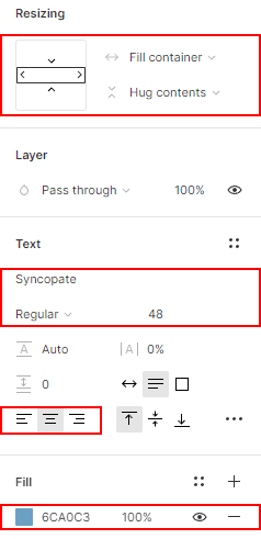
Turn the blue fill color and font properties to a style by clicking the + button next to each one. Name the fill color Secondary-Blue and font Header2. You should now have four styles – Header1, Header2, Background and Secondary-Blue.
Duplicate the CONTINUE text four more times, changing the text of each to the following:
- NEW GAME
- MULTIPLAYER
- SETTINGS
- EXIT
Finally, change the fill color of NEW GAME to white to simulate the “on hover” look. MainScreen should now look like this:
Design the carousel
The last part of MainScreen is to add two small carousels to the bottom part of the main content area. The actual carousel will be made up of two pieces – a rectangle that represents space for an image and three small dots for navigation. Before putting the pieces together you’ll first create the circle navigation at the bottom. There are two states for the circle – selected, which is filled, and unselected which only has a border.
Since the states of the navigation are so similar you will design them as a new component that uses the variant feature to toggle the style. A variant is a handy way to organize multiple components that are like each other. As you will see shortly, you’ll use drop down options to alter which one is displayed in your design.
Pick the Ellipse tool and click anywhere near the carousel. Name it Carousel\_Navigation and set the following properties:
- Width & Height: 20
- Fill > Color: Background
Convert Carousel\_Navigation to a main component. With the component selected, click the \+ button next to the Variants. This will duplicate the circle, giving you two. Select the parent, Carousel\_Navigation, and under the Variants \> Properties section, rename the options to Selected and Unselected.
Make sure the ellipse child of Unselected is, well, selected, and set these properties:
- Fill: None
- Stroke > Color: Background
- Stroke \> Size: 2px