Create a runtime inventory UI with UI Toolkit
A great UI is one of the most important parts of any game. It needs to be responsive and intuitive while looking awesome. In this tutorial, you’ll learn the basics of Unity’s new UI system, called UI Toolkit, by creating an in-game inventory system where your player can drag and drop items to move them around.

Learning Outcomes
What is great about learning UI Toolkit is you can apply the same skills to create custom UI and extensions for the Unity Editor, runtime debugging tools, and runtime UI for your games. At the end of this tutorial you will be able to:
- Design UIs by using the UI Builder tool.
- Design UIs through C# and USS (for styling).
- Instantiate your UI at runtime.
- Manipulate VisualElement styles at runtime, including setting a new position.
- Register and handle events for the UI.
Prerequisites
- You need Unity 2020.2.1f1 or later to follow along with this tutorial.
- This tutorial assumes you have basic knowledge of Unity and intermediate knowledge of C#.
- Download the starter project from the GitHub repository.
Resources
This project uses assets from Game-Icons.net and inspiration from from Wenrexa’s free UI Kit #3 for the design.
Getting started
UI Toolkit (formerly UI Elements) is Unity’s new UI system that can be used as an alternative to IMGUI (editor UI) and Unity UI (runtime UI). It’s still in preview, so some of the screenshots in this tutorial are likely to change as new releases occur.
UI Toolkit completely changes the paradigm on how runtime UI is created. Gone are the days of the Canvas and GameObject based setup. Instead, you develop your UI with patterns similar to web design, including using style sheets. All components that you make can be reusable, making the design pattern a lot quicker. There are two key concepts that are important to building a new UI:
- Unity eXtensible Markup Language Documents (UXML): Defines the structure of the user interfaces and reusable UI templates.
- Unity Style Sheets (USS): Similar to Cascading Style Sheets (CSS), USS allows you to set visual styles and behaviors to your UI.
Note: UXML and UI Document are two terms that are often used interchangeably during this tutorial.
There are many tools and resources that you can use throughout development to better understand how to setup your UI and how to debug issues:
- UI Builder: Visually create and edit your UXML and USS files. Located at Window > UI Toolkit > UI Builder.
- UI Debugger: A diagnostic tool that lets you traverse the hierarchy of the UI to get useful information around the underlying structure and styling. Located at Window > UI Toolkit > Debugger.
- UI Samples: Library of code samples for various UI controls. Located at Window > UI Toolkit > Samples.
Download the project files
This tutorial relies on scripts and models that are included in the starter project. You can download the starter project by:
- Clone and/or download the GitHub repository.
- Navigate to the Create-an-Inventory-UI-with UI-Toolkit\\projects\\starterProject folder in Unity.
You will see Scenes, Scripts and a Sprites folder in Assets/WUG. Open the Demo scene in Assets/WUG/Scenes.
Install UI Toolkit for runtime & UI Builder
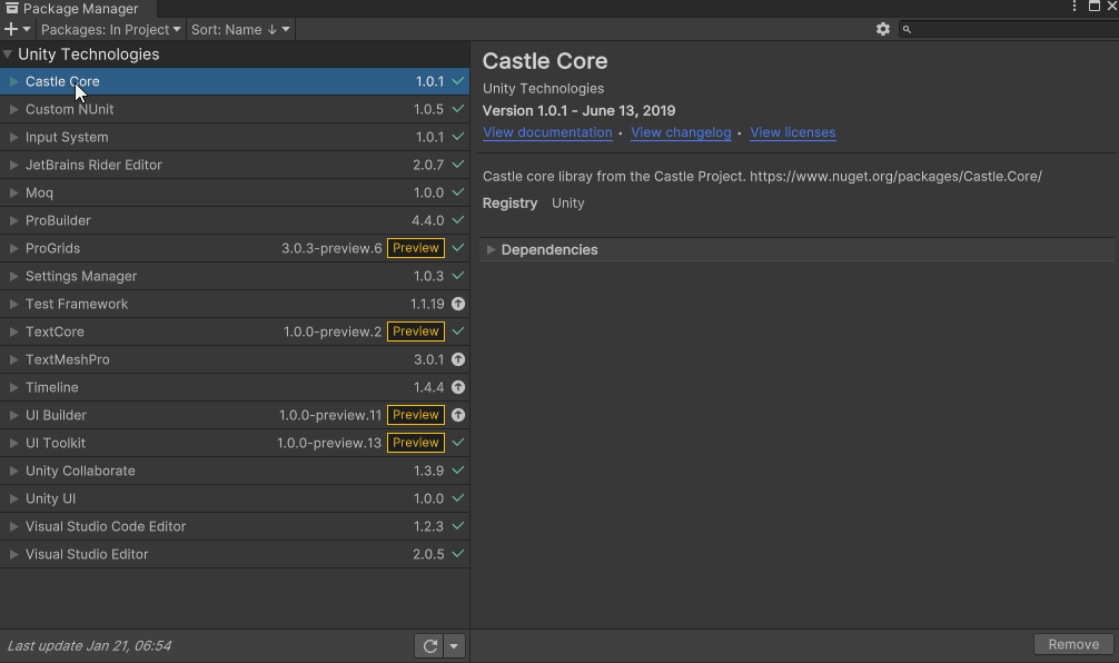
UI Toolkit is now shipped via the Unity Editor. However, the features that are needed to use UI Toolkit at runtime require the installation of the latest package. Since the package is not discoverable in the editor, you will need to add it by doing the following:
- Go to Window > Package Manager.
- Click on the + button and choose Add Package from git URL.
- Enter the following URL: com.unity.ui.
You will need to install UI Builder if you are on an editor version earlier than 2021.1:
- First make sure Preview Packages is turned on by going to Project Settings > Package Manager. Check Enable Preview Packages under the Advanced Settings section.
- Back in Package Manager, search for UI Builder and click Install.
Note: As of the writing of this tutorial, there is a bug when first installing the UI Toolkit package that requires you to restart Unity. You will know that this still applies if you get a series of console errors after installing.
Design the Inventory UI
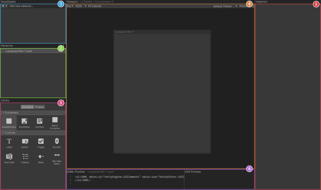
UI Builder is a way to visually create and edit UXML and USS files. It is also highly useful if you are creating your assets via code and want to mockup how something might look or to see what the proper syntax is for a style variable. Open the window by going to Window > UI Toolkit > UI Builder.
UI Builder is broken out into six different sections:
- StyleSheets: Manage the stylesheets and individual selectors that are used in this document. Style Sheets can be shared across multiple documents, thereby maximizing reusability.
- Hierarchy: A list of all elements that are within the document.
- Library: Contains a list of standard elements that can be instantiated. The Standard tab contains UI Documents from Unity. The Project tab contains UI Documents created in your project.
- Viewport: Visual of the UI document.
- Inspector: Contains modifiable attributes and style properties for the element currently selected in the hierarchy or StyleSheet sections.
- Code Preview: Displays the UXML and USS code that UI Builder is generating based on your decisions.
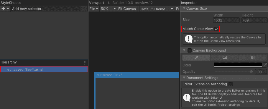
Now it’s time to create the Inventory UI. Inside UI Builder, click on the first item in the Hierarchy window, called «unsaved window».uxml. This pulls up the base properties. Check the Match Game View checkbox. This ensures that the UI scales with the screen.
Next, Drag VisualElement from the library and drop it in the Hierarchy window. Click on it to pull up the properties. Set the following:
- Name: Container
- Flex > Grow is 1.
- Align > Align Items: center
- Align > Justify Content: center
Drag another VisualElement into the hierarchy window and make it a child of the Container. Set the following properties:
- Name: Inventory
- Flex > Grow is 1
- Size > Width & Height: 50% and 75%
- Size > Max > Width & Height: 50% and 75%
- Margin & Padding > Padding: 10px
- Background > Color: #1C2024
- Border > Color > Top: #FFC500
- Border > Width > Top: 5
Add a Label control as a child of Inventory. Set the following properties:
- Name: Header
- Text: Inventory
- Text > Size: 24
- Text > Color: #FFC500
- Margin & Padding > Margin > Bottom >: 10px
- Border > Color > Bottom: #404A52
- Border > Width > Bottom: 1
Add a VisualElement control as a child of Inventory. Set the following properties:
- Name: SlotContainer
- Flex > Grow is 1.
- Flex > Direction: Row
- Flex > Wrap: Wrap
- Align > Justify Content: center
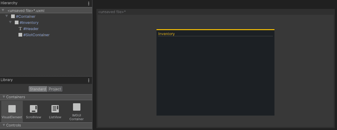
Save your UXML document by going to File > Save As at the top of the Viewport section and name it Inventory. You should now have a window that looks like this:
Note: The layout engine that UI Toolkit uses is the open source project called Yoga, which implements a subset of Flexbox. Flexbox is an HTML/CSS based layout system. A useful guide to Flexbox can be found here.
Create the stylesheet
As you can see, there are a lot of different properties that can be set for the elements. By setting them directly in the inspector like you did, you created what is called “Inline Styles”. This means that the styles are written directly to the UXML file, rather than being saved in the USS file. This is not great from both a maintenance and reusability standpoint. Fortunately, extracting the styles is easy to do.
Create a USS file to store the styles:
- In the Stylesheet section, click the + sign and select Create new USS. Name it Inventory.
Next, you will generate a class for each element that you created. Here’s how to do it for Container:
- Click on the Container element. On the Inspector panel there is a section called StyleSheet, which has a sub-section called Style Class List.
- In the Style Class List is a text box, this is where you will enter the name of the class you want to generate. In this case, call it container.
- Click on the Extract Inlined Styles to New Class button.
Note: If you want to reuse any of the styles that you have saved you can simply drag and drop them onto the element in the Viewport. Alternatively, type the name of an existing style in the Style Class List text box and click on Add Style Class to List.
You should see the new “container” class appear under the Inventory.uss file in the StyleSheets section. Repeat this process for each of the elements, using the name of the element for the class. Once done, save your UI by going to File > Save.
A quick look at some important styles
Most of the styles are relatively self explanatory or their impact can be discovered easily by tweaking some properties. Here’s a few of the main ones that you’ll work with:
Note: You can read more about style properties in the UI Builder manual, here
Display and visibility
Display and visibility style properties are two ways that you can toggle whether the player can see the element. They have one major difference:
- Visibility: The layout engine and event system will still process an element that has their visibility set to hidden.
- Display: The layout engine and event system will ignored the element if set to display: none.
Consider a scenario where you have a button that gets click events. If you want to hide the button but keep the click events coming through, you’d set the style to visibility:hidden. If you wanted to hide the button and prevent the events from going through, you’d set the style to display:none.
Flex-basis, Flex-grow and flex-shrink
Flex basis, grow and shrink are probably the three most commonly used properties as they essentially define how the elements will or will not scale relative to each other. Here’s a quick explanation of each:
- flex-basis: The default size of an element before the remaining space is distributed. Auto means “look at my height and width values”.
- flex-grow: Defines whether the item can grow if necessary. It’s a ratio shared with all siblings.
- flex-shrink: Defines whether the item should shrink if necessary.
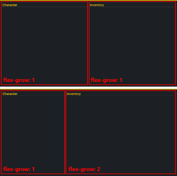
Consider a scenario where you wanted to have the inventory UI next to the equipment UI. Instead of sharing the screen space 50/50, you want the Inventory UI to be bigger. To achieve this, you could set Inventory’s flex-grow higher than the Equipment flex-grow, like so:
Absolute and relative positioning
By default, all newly added elements have their positioning set to relative. This enables them to be processed by the Layout engine, and thus brings a lot of value around ease of maintenance. In fact, it’s generally discouraged to use the Absolute position mode unless necessary.
Elements with a position of absolute are essentially ‘invisible’ to the layout engine. This means that properties like flex basis, flex-shrink, and flex-grow are irrelevant. Instead, you must set the width/height and Position > Left, Top, Right and Bottom properties directly.
Note: In this project we will set just one element’s position to absolute – the “ghost” icon that moves with the mouse when you’re dragging an inventory item. The rest will be left at relative position.
Add the Inventory UI to the game
It’s time to add the screen to your scene! UI Toolkit comes with a UI Document component, which is where you specify two major areas:
- Panel Settings: The panel is the root VisualElement that all UI Documents are attached to. It’s what handles drawing the UI in the Scene at runtime. There are several settings that you can set to define how the UI should appear at runtime.
- UI Document Component: Reference to UXML files that should be associated with the panel (root VIsualElement). You can have multiple of these.
You must also have a UI Toolkit Event System component. The Event System component is what handles the input and sends the events to all active panels. Without it, your input will not be routed. There are two you can choose from, depending on if you are using the old or new Input System.
Setup the Scene
You can add a UI Document GameObject to your scene to have Unity generate the necessary components and PanelSettings asset for you. Here’s how you can quickly set up the scene:
- Add the UI Document GameObject by going to GameObject > UI Toolkit > UI Document.
- Name it UserInterface.
- Set the Source Asset to the Inventory UXML file that you saved earlier.
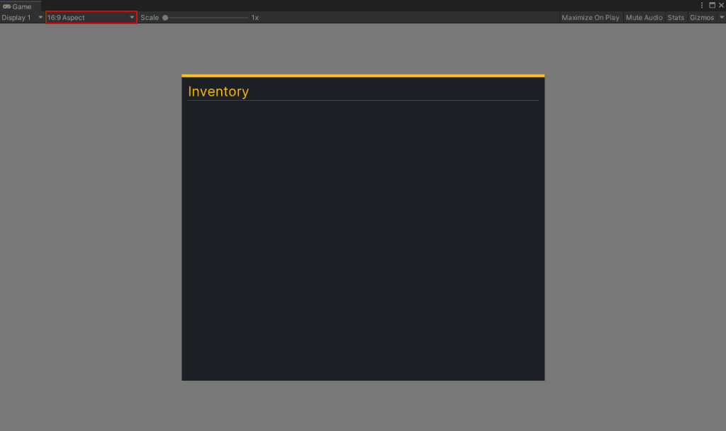
Set your Game window aspect ratio to 16:9 and push play to see your inventory added to your screen.
Note: I’ve noticed a discrepancy in pixels when the aspect ratio is Free Aspect or 16:10, so I have been sticking to 16:9 for now.
Note: Go here for official documentation on setting up your Runtime UI. It has useful information about the display order of multiple UI Documents and how to set route the new Input System events.
Code the Inventory Slots
I’ve found that UI Builder isn’t always the right approach for creating my VisualElements. Most of the time I end up building the assets via C# code to keep things clean. For the InventorySlot, let’s skip the UI Builder and instead create them via C#.
You can also code the UXML file directly. You can read more about that method here.
InventorySlot will consist of two elements for it’s hierarchy – the root (which is a VisualElement) and a child that is an Image. The image will only have a sprite if the slot has an item.
Create a new script called InventorySlot. Have it inherit from VisualElement and add the following code:
public class InventorySlot : VisualElement
{
    public Image Icon;
    public string ItemGuid = "";

    public InventorySlot()
    {
        //Create a new Image element and add it to the root
        Icon = new Image();
        Add(Icon);

        //Add USS style properties to the elements
        Icon.AddToClassList("slotIcon");
        AddToClassList("slotContainer");
    }
}
When the InventorySlot is first instantiated, it'll create a new Image element and add it as a child to the root. Next, it adds two new styles slotContainer and slotIcon. These styles do not exist though, so now would be a good time to add them. Open the Inventory.uss stylesheet and add the following classes to the end:
.slotContainer {
    width: 128px;
    height: 128px;
    margin: 5px;
    border-left-color: rgb(48, 48, 48);
    border-right-color: rgb(48, 48, 48);
    border-top-color: rgb(48, 48, 48);
    border-bottom-color: rgb(48, 48, 48);
    background-color: rgb(9, 19, 21);
    background-image: url('/Assets/WUG/Sprites/ItemSlotBackground.png');
    border-top-left-radius: 3px;
    border-bottom-left-radius: 3px;
    border-top-right-radius: 3px;
    border-bottom-right-radius: 3px;
}

.slotIcon {
    padding: 15px;
    flex-shrink: 0;
    flex-grow: 1;
}- .slotContainer will be a 128×128 square with ItemSlotBackground.png set to the background-image . Setting the border-radius to 3px will give it slightly rounded corners. Finally, margin will add some space between all of the InventorySlots.
- .slotIcon uses flex-grow to ensure that it fills up all available space but then applies a padding of 15px to make sure it’s slightly smaller than the parent.
You need to have each slot instantiated before you can see InventorySlot in action. Create another class called InventoryUIController. Have it inherit from MonoBehaviour and add the following code:
public List<InventorySlot> InventoryItems = new List<InventorySlot>();

private VisualElement m_Root;
private VisualElement m_SlotContainer;

private void Awake()
{
    //Store the root from the UI Document component
    m_Root = GetComponent<UIDocument>().rootVisualElement;

    //Search the root for the SlotContainer Visual Element
    m_SlotContainer = m_Root.Q<VisualElement>("SlotContainer");

    //Create InventorySlots and add them as children to the SlotContainer
    for (int i = 0; i < 20; i++)
    {
        InventorySlot item = new InventorySlot();

        InventoryItems.Add(item);

        m_SlotContainer.Add(item);
    }
}
Every UI Document component has a root Visual Element, which is stored in m\_Root for easy access later. You can use either Q or Query to search for a specific element within the hierarchy. Providing either the type or the name is optional. In other words, these two lines accomplish the same thing for the Inventory UI:
//Option 1:
m_SlotContainer = m_Root.Q<VisualElement>("SlotContainer");

//Option 2:
m_SlotContainer = m_Root.Query("SlotContainer");
Note: You can return the first result of the query by appending .First() at the end and the last by appending .Last(). For example: m\_SlotContainer = m\_Root.Query("SlotContainer").First();
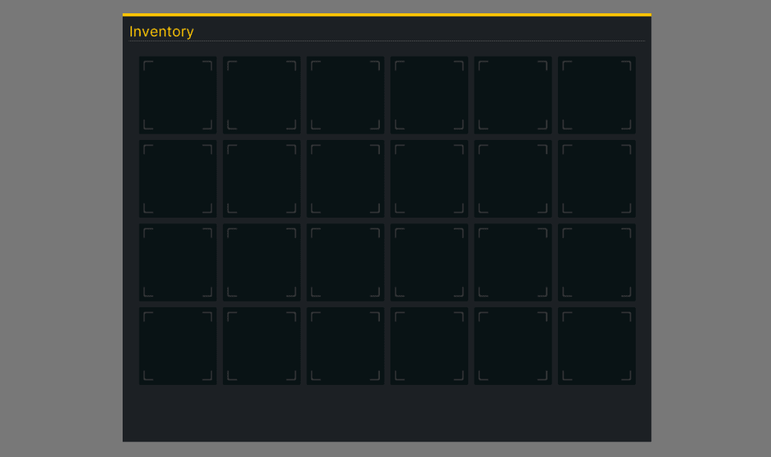
Add InventoryUIController as a component to the UserInterface GameObject and push Play. You should see this:
Creating Templates
What’s really cool about UI Toolkit is the reusability. You’ve seen this a bit with styles, and it can also be done by creating custom controls in C# that you can still use in UI Builder. To do this, add the following code to the end of your InventorySlot class:
#region UXML
[Preserve]
public new class UxmlFactory : UxmlFactory<InventorySlot, UxmlTraits> { }
[Preserve]
public new class UxmlTraits : VisualElement.UxmlTraits { }
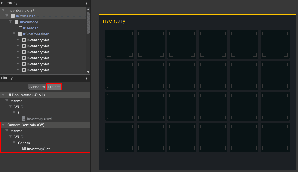
#endregionOpen UI Builder and click on the Project tab under the Library section. InventorySlot should now be an option under the Custom Controls (C#) section. Drag and drop InventorySlot as a child under SlotContainer.
Be sure to delete your loop in the InventoryUIController class if you decide to instead add your slots via UI Builder. I’ll leave the loop in for this tutorial.
Populate and interact with the UI
Now that you have an inventory that looks decent and has slots, it’s time to make it interactable! Before we jump into how the event system works, it’s probably a good idea to review GameController, a helper script that came bundled with the starter project.
GameController generates a small item database that has three items in it. Each item has a friendly name, GUID, icon, and “CanDrop” boolean. It also contains the player’s inventory data and an OnInventoryChanged event that is called on Start, which the UI will listen for. You can find the script on the GameManager GameObject in the Demo scene.
Add a hook for OnInventoryChanged
Before you can populate or interact with the UI, you’ll need to give InventorySlot the ability to hold and drop items. Add the following code to InventorySlot:
public void HoldItem(ItemDetails item)
{
    Icon.image = item.Icon.texture;
    ItemGuid = item.GUID;
}

public void DropItem()
{
    ItemGuid = "";
    Icon.image = null;
}
If InventorySlot is holding anything, the GUID and Icon will be set. If it’s not, they’ll be empty/null. It is time to populate the initial view based on the player’s inventory. Add the following to the end of InventoryUIController.Awake:
GameController.OnInventoryChanged += GameController_OnInventoryChanged;Add the following new method:
private void GameController_OnInventoryChanged(string[] itemGuid, InventoryChangeType change)
{
//Loop through each item and if it has been picked up, add it to the next empty slot
foreach (string item in itemGuid)
{
if (change == InventoryChangeType.Pickup)
{
var emptySlot = InventoryItems.FirstOrDefault(x => x.ItemGuid.Equals(""));
if (emptySlot != null)
{
emptySlot.HoldItem(GameController.GetItemByGuid(item));
}
}
}
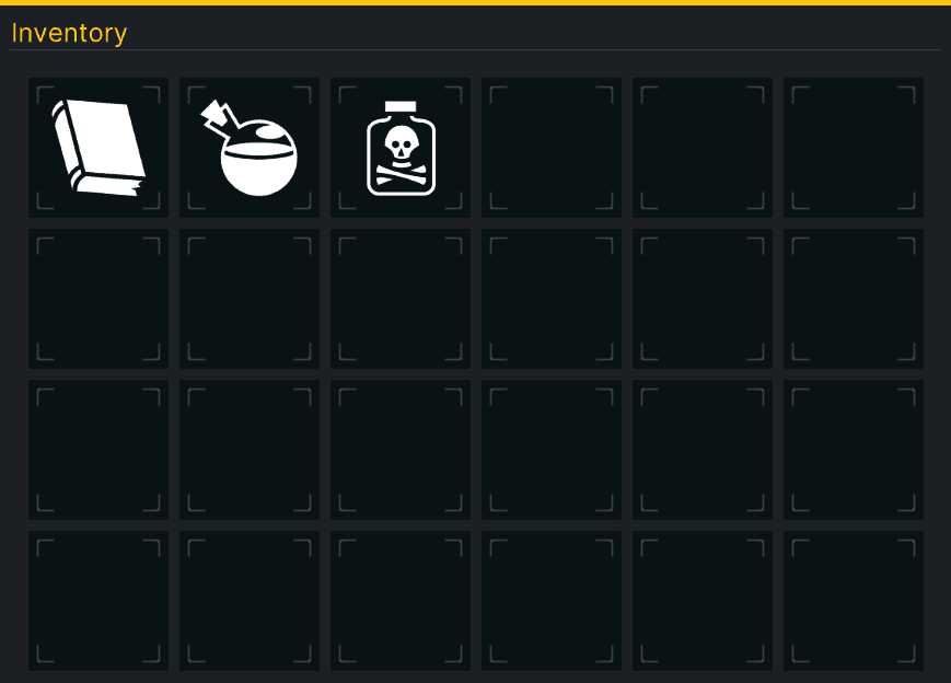
}Save your scripts and push play in Unity. You should now have three items in the player’s inventory!
Add drag and drop behavior
A “ghost icon” will appear when the player initiates a drag event on an InventorySlot. This lets you freely move the image around the screen without worrying about any funky repositioning logic. Create the ghost image by going back to UI Builder and adding a new VisualElement as a child of Container. Name it GhostIcon. Set three styles:
- Position: Absolute
- Size > Width & Height: 128×128
- Visibility: Hidden
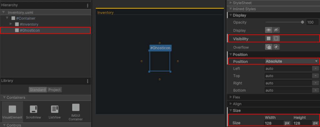
Make sure that GhostIcon is the last child. Otherwise, it’ll appear behind some of the elements. You can set a temporary icon under Background > Image to see how it’ll render.
Add a reference to GhostIcon on InventoryUIController by adding a new global variable:
//Global variable
private static VisualElement m_GhostIcon;
Add this line to the end of InventoryUIController.Awake (or really just after you set m\_Root):
m_GhostIcon = m_Root.Query<VisualElement>("GhostIcon");Since you are in InventoryUIController, let’s wrap up adding the full drag/drop logic. Add two more global variables:
private static bool m_IsDragging;
private static InventorySlot m_OriginalSlot;
Add a new StartDrag method:
public static void StartDrag(Vector2 position, InventorySlot originalSlot)
{
    //Set tracking variables
    m_IsDragging = true;
    m_OriginalSlot = originalSlot;

    //Set the new position
    m_GhostIcon.style.top = position.y - m_GhostIcon.layout.height / 2;
    m_GhostIcon.style.left = position.x - m_GhostIcon.layout.width / 2;

    //Set the image
    m_GhostIcon.style.backgroundImage = GameController.GetItemByGuid(originalSlot.ItemGuid)
      .Icon.texture;

    //Flip the visibility on
    m_GhostIcon.style.visibility = Visibility.Visible;
}
StartDrag is called by InventorySlot.OnPointerDown and its purpose is to, well, start the drag process.The first interesting bit of logic here is that the new position for m\_GhostIcon is set via their style properties. By subtracting half of the height and width, you ensure that the m\_GhostIcon appears center to the mouse.
Note: m\_GhostIcon.style.top is setting the position relative to the parent element. If you are adding this inventory as part of a broader UX (say a character sheet) then you must make sure that the Ghost Icon is a direct child of the root element. For example, you could have a GameScreen UI that has a Quick Launch and Character Sheet as children. Ghost Icon would need to be a peer of GameScreen.
m_GhostIcon.RegisterCallback<PointerMoveEvent>(OnPointerMove);
m_GhostIcon.RegisterCallback<PointerUpEvent>(OnPointerUp);
Add the final methods for InventoryUIController – OnPointerMove and OnPointerUp:
private void OnPointerMove(PointerMoveEvent evt)
{
    //Only take action if the player is dragging an item around the screen
    if (!m_IsDragging)
    {
        return;
    }

    //Set the new position
    m_GhostIcon.style.top = evt.position.y - m_GhostIcon.layout.height / 2;
    m_GhostIcon.style.left = evt.position.x - m_GhostIcon.layout.width / 2;

}

private void OnPointerUp(PointerUpEvent evt)
{
    if (!m_IsDragging)
    {
        return;
    }

    //Check to see if they are dropping the ghost icon over any inventory slots.
    IEnumerable<InventorySlot> slots = InventoryItems.Where(x =>
           x.worldBound.Overlaps(m_GhostIcon.worldBound));

    //Found at least one
    if (slots.Count() != 0)
    {
        InventorySlot closestSlot = slots.OrderBy(x => Vector2.Distance
           (x.worldBound.position, m_GhostIcon.worldBound.position)).First();

        //Set the new inventory slot with the data
        closestSlot.HoldItem(GameController.GetItemByGuid(m_OriginalSlot.ItemGuid));

        //Clear the original slot
        m_OriginalSlot.DropItem();
    }
    //Didn't find any (dragged off the window)
    else
    {
        m_OriginalSlot.Icon.image =
              GameController.GetItemByGuid(m_OriginalSlot.ItemGuid).Icon.texture;
    }

    //Clear dragging related visuals and data
    m_IsDragging = false;
    m_OriginalSlot = null;
    m_GhostIcon.style.visibility = Visibility.Hidden;

}
OnPointerMove
is pretty straight forward – it’s just taking the latest mouse position and setting m\_GhostIcon’s position to it.
- OnPointerUp
I highly recommend you take a bit of time to read about how UI Toolkit dispatches events, which you can do here. This will be especially important if you have multiple UI Documents in your scene.
Trigger the drag process
Each InventorySlot will monitor for OnPointerDown which will indicate whether the drag event should be triggered. Register a new event listener at the end of the InventorySlot constructor:
RegisterCallback<PointerDownEvent>(OnPointerDown);Create a new OnPointerDown method with the following code:
private void OnPointerDown(PointerDownEvent evt)
{
    //Not the left mouse button
    if (evt.button != 0 || ItemGuid.Equals(""))
    {
        return;
    }

    //Clear the image
    Icon.image = null;

    //Start the drag
    InventoryUIController.StartDrag(evt.position, this);
}
OnPointerDown will first make sure that the left button is pushed and that the InventorySlot is actually carrying an item. If it is, then it’ll call InventoryUIController.StartDrag(). Here’s the full list of the button to integer mapping:
- Left: 0
- Right: 1
- Middle: 2
That’s it! Hit play and see your drag and drop in action:
Bonus: Samples & Debugging the UI
UI Toolkit comes with sample controls, sample scripts and a debugger. All three are very helpful when working with the new UI system.
Debugger
The UI Toolkit Debugger is as useful as the UI Builder and can be found at Window > UI Toolkit > Debugger. For anyone familiar with web development, you will notice that the debugger behaves similar to debug tools you’d find in the browser.
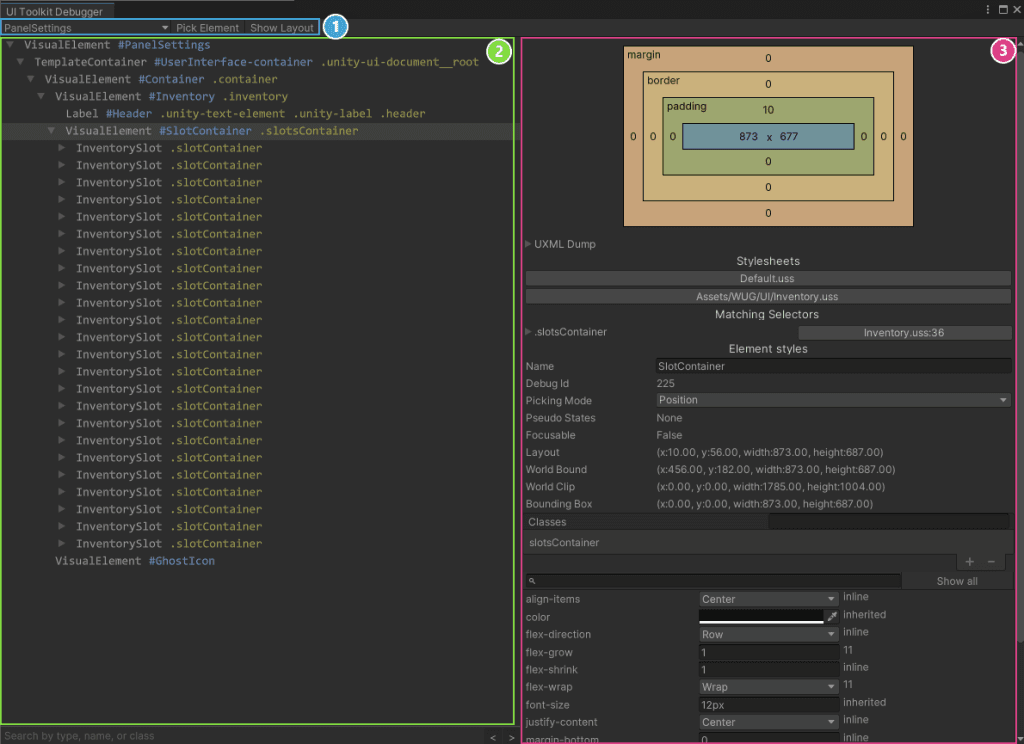
There are three main sections for the window:
- Top Toolbar: The first drop down is how you pick the area to debug. When using the debugger with a runtime UI, you’ll want to look for the PanelSettings item. Pick Element and Show Layout are ways for you to navigate to the right visual element that you want to view.
- Hierarchy: Displays how the hierarchy is currently rendered. You can select an item here to drill into the styles associated.
- Layout and Style: This panel can be used to see the current layout and styles applied. You can edit values to see changes at runtime. (They do not serialize back though, so make sure you write down any you want to keep!)
Control Samples
Control examples are installed alongside UI Toolkit and can be found under Window > UI Toolkit > Samples. Keep in mind that most of the controls are for creating editor UI. That being said, they’re great references for how to interact with UI Toolkit.
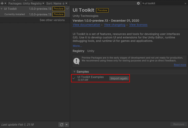
Script Samples
The UI Toolkit package has optional script examples that can be imported into your project. Go to Package Manager > UI Toolkit and expand the Samples section. You can also find the scripts on the UI Toolkit GitHub.
Challenge: Add a quick slot UI
There are a lot of really interesting ways that you can extend out the inventory system! A great challenge would be to add five quick slots at the bottom of the screen. Here’s how the logic could work:
- If the player drags an item from the Inventory to the Quick Slot, it gets added to the Quick slot, but not deleted from the Inventory.
- If the player drags an item from the Quick Slot back to the inventory, it’s only removed from the QuickSlot.
- The player can reorder Quick Slot items.
- The player can lock the Quick Slot bar so that they can only edit it when the Inventory window is visible.
Here’s a few things to keep in mind:
- You can create more UI documents within the scene – just attach the same Panel Settings to each one.
- Avoid disabling the GameObject that has the UI Document as a way to toggle the window off. Instead, toggle
Have fun with the challenge and be sure to reach out on Twitter or the GitHub Discussion Forum to show me what you’ve made!