Design a grid style inventory window with UI Toolkit
Inventory systems are a great way to help facilitate how you want the player to engage in your game. Perhaps one of the most important components to consider are the constraints you want the system to help enforce. For example, many games gate what a player can carry based on the total weight of all the items. A slightly less common way is based on the item size. This has been done by games such as Resident Evil 4 and Dues Ex. In addition to controlling how much a player can carry, it also creates a mini game out of the inventory by requiring them to strategically organize to maximize what they can carry.
This tutorial is part of a series which will explore how you can create an inventory that requires the player to sort by item size. Part 1 will walk through creating the UI design in UI Builder.
Learning Outcomes
This tutorial will cover the basics of UI Toolkit and how you can create a complex inventory UI. By the end, you will learn:
- A practical workflow for building up a complex UI with different zones.
- The basics of using UI Toolkit & UI Builder.
- How to create and work with a stylesheet.
- How to add the UI to a scene
Prerequisites
- You should have Unity 2021.1.12f1 or later to follow along with this tutorial.
- This tutorial assumes you have basic knowledge of Unity.
This tutorial will work with earlier versions of Unity but has a higher chance of having UI Toolkit related bugs and may have different installation requirements. Check out the UI Builder release notes for more information.
Resources
Getting started
This tutorial does not have a starter project. Instead, create a new Unity project, ideally using 2021.1 or later. The UI uses the Clean Vector Icons (Free) pack from the Asset Store. Download add it into your project.
Install UI Toolkit for runtime & UI Builder
Note: The steps in this section are not needed if you are on 2021.2 or above.
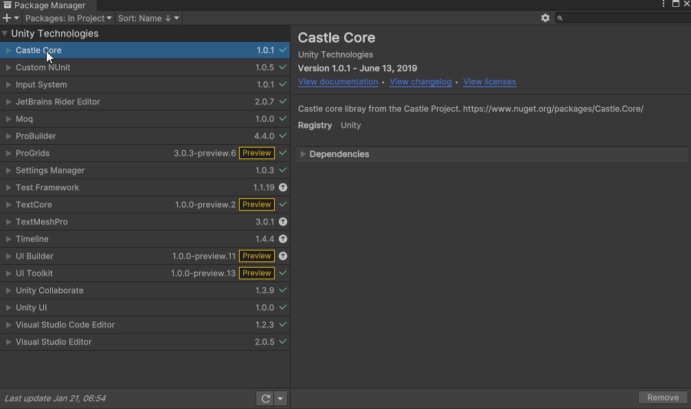
UI Toolkit and UI Builder are packaged with Unity Editor in version 2021.1 and above. However, the features that are needed to use UI Toolkit at runtime require the installation of the com.untiy.ui package. Since the package is not discoverable in the editor, you will need to add it by doing the following:
- Go to Window > Package Manager.
- Click on the + button and choose Add Package from git URL.
- Enter the following URL: com.unity.ui.
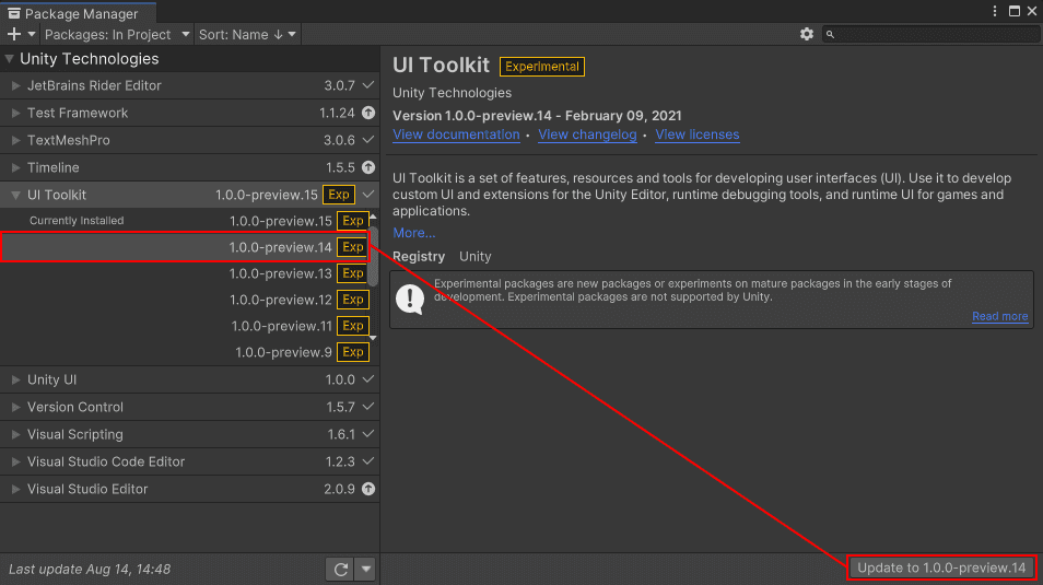
As of the writing of this tutorial, the latest UI Toolkit version is 15, which is incompatible with the UI Builder version bundled in editor version 2021.1. If UI Builder is broken, you will need to downgrade to package version 14:
- In package manager, expand UI Toolkit and select See other versions.
- Pick 1.0.0-preview.14 and click the Update to 1.0.0-preview-14 button.
- Restart Unity to clear any errors that won’t go away.
Getting to know UI Toolkit
UI Toolkit (formerly UI Elements) is a Unity UI system that can be used as an alternative to IMGUI (editor UI) and Unity UI (runtime UI). It’s still in preview, so some of the screenshots in this tutorial are likely to change as new releases occur.
UI Toolkit follows UI patterns similar to web design, including the ability to define stylesheets! Stylesheets are a great way to abstract away properties that define the look of various elements in your UI. This gives you the ability to define once, and use any where. Additionally, all components that you make can be reusable, making the design pattern a lot quicker. There are two key assets that are important to building a new UI:
- Unity eXtensible Markup Language Documents (UXML): Defines the structure of the user interfaces and reusable UI templates.
- Unity Style Sheets (USS): Similar to Cascading Style Sheets (CSS), USS allows you to set visual styles and behaviors to your UI. These can be used in any UXML file.
Note: UXML and UI Document are two terms that are often used interchangeably during this tutorial.
The layout engine that UI Toolkit uses is the open source project called Yoga, which implements a subset of Flexbox. Flexbox is an HTML/CSS based layout system. Understanding the basics of Flexbox is very helpful when designing your UI. A useful guide to Flexbox can be found here
UI Toolkit Resources
There are many tools and resources that you can use throughout development to better understand how to setup your UI and how to debug issues:
- UI Builder: Visually create and edit your UXML and USS files. Located at Window > UI Toolkit > UI Builder.
- UI Debugger: A diagnostic tool that lets you traverse the hierarchy of the UI to get useful information around the underlying structure and styling. You can also temporarily change properties to see how they impact your running project. Located at Window > UI Toolkit > UI Debugger.
- UI Samples: Library of code samples for various UI controls. Located at Window > UI Toolkit > Samples.
Note: UI Toolkit was originally designed as an alternative for IMGUI and many of the controls that you get out of the box with UI Builder do not work with the Runtime version.
UI Builder Basics
UI Builder is a way to visually create and edit UXML and USS files. I am often creating bits of my UI through code and often times use UI Builder to mockup mockup how it will look or to see what the proper syntax is for a style variable. Open the window by going to Window > UI Toolkit > UI Builder.
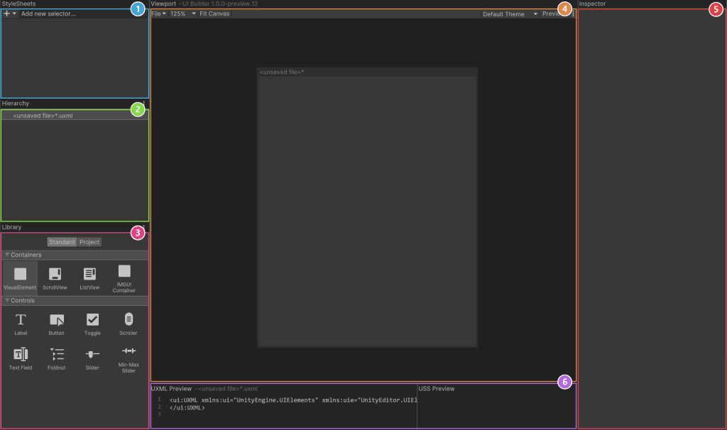
The window has six sections:
- Stylesheets: Manage the stylesheets and individual selectors that are used. Style Sheets can be shared across multiple UXML files, thereby maximizing reusability.
- Hierarchy: A list of all elements that are in the file.
- Library: Contains a list of standard elements that can be instantiated. The Standard tab contains UI Documents from Unity. The Project tab contains UI Documents created in your project.
- Viewport: Visual of the UI document.
- Inspector: Contains modifiable attributes and style properties for the element currently selected in the hierarchy or Stylesheet sections.
- Code Preview: Displays the UXML and USS code that UI Builder is generating based on your decisions.
Configure the resolution and container elements
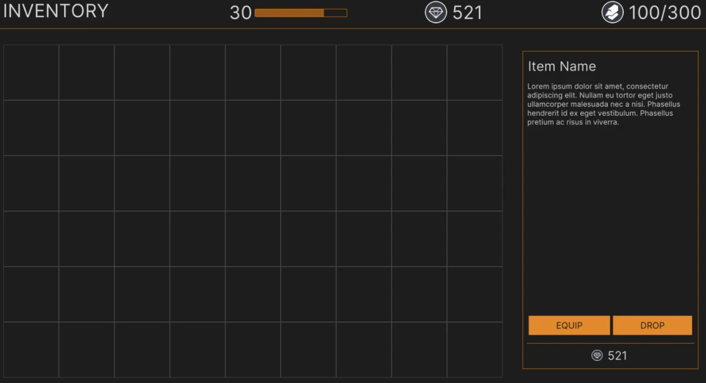
The inventory screen that you’ll design will have six major zones that provide the player with different bits of information. They are:
- Window title
- Character level and current experience
- Currency available
- Total weight of items carried
- Items in the inventory
- Selected item details
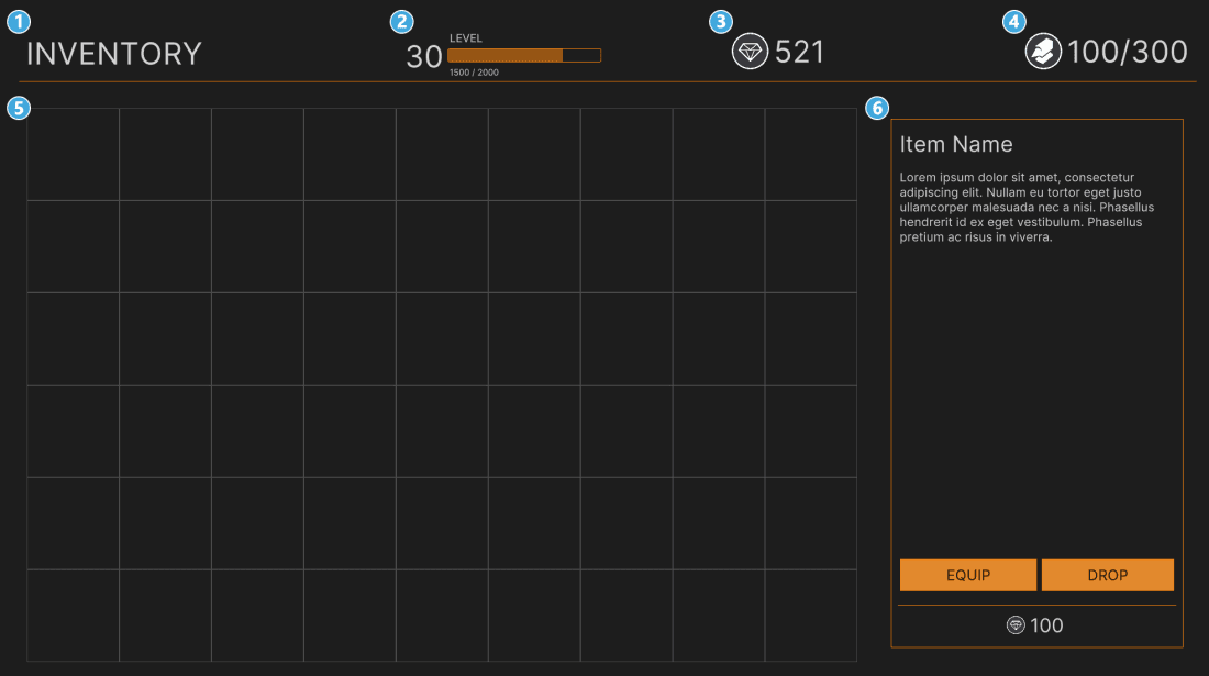
You can design a UI that is flexible and scales with the resolution of your game. To keep it simple and predictable, I’ve designed this screen based on 1920×1080 resolution. First thing you will do is set the right resolution for both the Game window and UI Builder:
- In Unity, click on the Game window and set the display to Full HD (1920×1080).
- Inside UI Builder, click on the first item in the Hierarchy window, called «unsaved window».uxml. This pulls up the base properties.
- Check the Match Game View checkbox. This ensures that the UI scales with the screen.
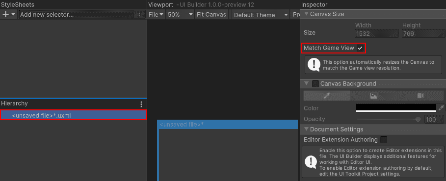
Note: In theory, you should be able to set the Size of the canvas to 1920×1080, rather than selecting Match Game View. However, I have noticed an occasional bug that purges the size values when the editor is restarted.
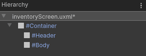
Setup the Container Elements
Drag VisualElement from the library and drop it in the Hierarchy window. Click on it to pull up the inspector properties. Set the following:
- Name: Container
- Flex > Grow is 1.
- Background > Color: #1D1D1D
Note: Setting the Container to Flex-grow 1 tells the layout engine to expand the VisualElement to the full height/width of the window. Read more about Flex-grow here.
The body of the inventory is broken into two sections. Above the yellow line is the header, and below is the body. Set both of these up now.
Add a VisualElement as a child of the Container. Set the following properties:
- Name: Header
- Flex \> Direction: Row
- Size \> Height: 100px
- Size \> Max Height: 150px
- Size \> Min Height: 100px
- Margin & Padding > Padding: 10px 10px 0px 0px
- Border \> Color \> Bottom: #FF7C00
- Border \> Color \> Width: 0px 0px 0px 1px
Add another VisualElement as a child of Container. Set the following:
- Name: Body
- Flex \> Grow: 1
- Flex \> Direction: row-reversed
- Margin & Padding \> Padding: 10px
There were two options that made sense for the direction of Body: row and row-reversed. Using row-reversed will ensure that the Visual Elements generated for each item in the inventory appear above everything in the hierarchy. (You’ll do this in part 2.)
Here’s how the properties behave:
Row: Displays the children left to right, sorting from the first child to the last child.

Row\-reversed: Displays the children left to right, sorting from the last child to the first child.
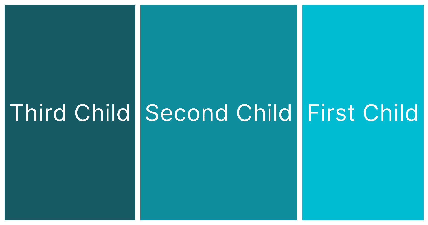
Don’t worry if the impact of this decision doesn’t quite make sense yet. You’ll write the code for generating the VisualElements in Part 2, which will give you the opportunity to experiment with the two settings.
Design the header
The header is broken into four sections, the window title, character level, currency, and total weight.
Window Title
Drag a Label into the hierarchy window and make it a child of Header. Set the following:
- Name: lbl\_Header
- Text: INVENTORY
- Flex \> Grow: 1
- Text \> Align: Middle
Your hierarchy should look like this: